Wanted to share with you one of my last works: total re-design of old site.Customer gave me some kind of “full freedom” in the design process. Still waiting for the final review from the customer, but know there will be no major changes.
The original (old) site has been designed and built by using tables.
Each page seems to lack responsiveness below a certain width. There’s also something affecting vertical heights of certain divs…looks like the height is inheriting VW properties? I’d love to take a closer look if you can post your Webflow share link! So much easier than poking around in inspector.
Edit: On Performances, I LOVE the hover effect on the YouTube videos!!!
Ok guys, it seems like site has a bug with responsiveness ONLY on iPhones… For some reason, it does not react on any media quesry. To check this I set the content row to fixed width 320 px, but on iPhone views it still look huge.
Really have no idea what it can be and how to fix it
Now things look even more weird. Here is a screenshot of how settings of Main logo div looks like in Chrome. As you can see I set its minimal width to auto. I did it when I designed that section, at the first step.
And it shows absolutely correct in all views in Webflow designer
I’m a bit lost. Can you explain what the expected behavior is and what you’re seeing instead? (On my way to a meeting so I may not be able to reply to this for a bit…)
You opened site in Safari and it shows fixed width in tablet and mobile modes. But when I opening it in the Chrome browser min-width shows set to AUTO.
Now I wonder if it is only this one site issue, or we got a bug with “min-width” in Safari.
 Still waiting for the final review from the customer, but know there will be no major changes.
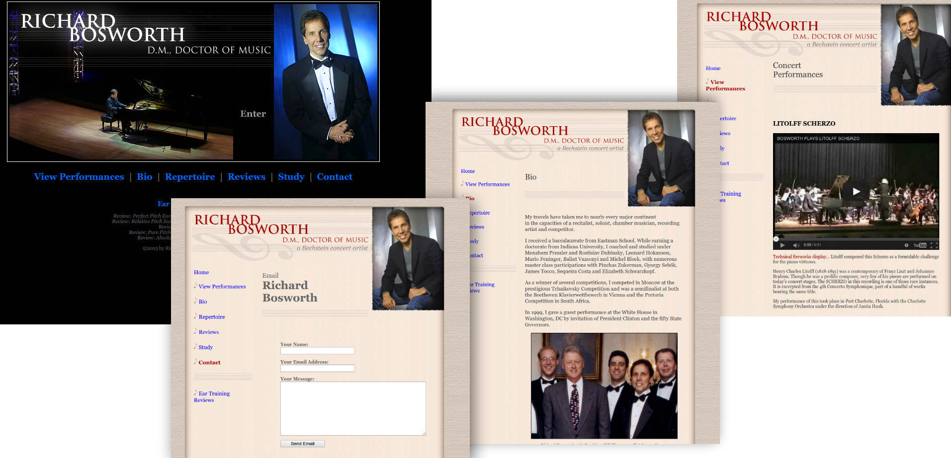


 So much easier than poking around in inspector.


 Can you explain what the expected behavior is and what you’re seeing instead? (On my way to a meeting so I may not be able to reply to this for a bit…)