Hello dear community,
I am building a multiple page website for a client and am going to deliver soon but I can’t make it responsive, I don’t understand what’s happening with my design!
If you are interested to help me, I invite you to go to page “S.U.P.L pneumatik” and check the menu called “En-tête”. I’ve tricked different things in order to make everything responsive and it looks perfect on my laptop.
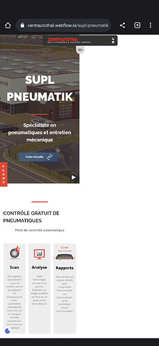
But when I open it on my Google Pixel 7 Pro phone, here is what I got:
It seems that some of the elements from my pages exceed the viewport parameters.
I hope that an expert could help me!
Best Regards
Here is my site Read-Only: LINK
(how to share your site Read-Only link)


