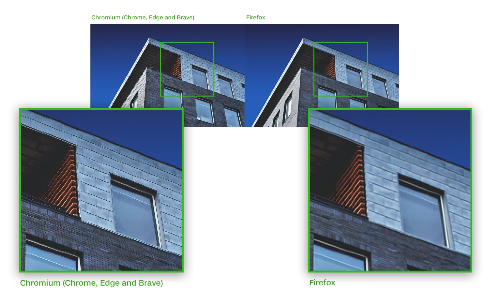
Is it a Webflow problem or a browser problem? The original image is 3800x2600 in a collection and dynamically scaled by Webflow.
1 Like
Hi there,
When working with images in collections, Webflow automatically creates responsive versions to optimize loading times across different devices. If you’re experiencing unexpected image scaling behavior, you can disable this feature for specific images:
- Select the image on the canvas
- Open the Settings panel
- Navigate to Image settings
- Check the “Disable responsiveness” checkbox
This will maintain the image’s original dimensions regardless of viewport size. For optimal performance, ensure you’re using a supported browser version when making these adjustments.
Hopefully this helps! If you still need assistance, please reply here so somebody from the community can help.
1 Like
There is no differende with “Disable responsiveness” on or off.
1 Like