Hey guys,
My images appear normal on web flow but on the browser they become very small. I am not sure how to fix this. Please help!
Project link: Webflow - Myportfolio
Hi @Tanishka_Sharma
Did you correct the issue?
I tested your live (.com) and webflow preview site (with Safari and Opera) and the images are rendering correctly?
Keiran
(Both images from your live .com site)
So I have not made any changes. Webflow does this randomly where it makes my images quite small sometimes and those changes are also reflected on my actual website.
Before they would look small on webflow sometimes but never vice versa
Hmm…so that is very strange!
Looking at your images in the Grid there is no discernable difference between the 1st six images that are rendering small and the other images??
If there were an issue with any of the images or Grid, I would expect all images to be affected?
Does it happen if there are any bandwidth issues when loading the page? I noticed that the images are set to ‘Lazy Load on Scroll’ and whether that might have a bearing on those images loading a thumbnail image until you scroll??
Sorry, I can’t offer a more solid solution or reason for why it’s happening.
Keiran
Hi @Tanishka_Sharma ,
Did you end up figuring out how to address this? Same thing happens for me. Randomly, some images render really tiny on the live website.
Kindly,
Ryan
Same here. This is a bug for sure. Same CSS style as other images that work and they’ll randomly shrink to a little thumbnail size. The image is set to 100% width of the parent container. Pixel dimension of the source file is more than adequate to fill the space.
Does anyone know if this if there is a fix for this as I am experiencing the same issue?
Same image class on multiple pages and all the images of the same class display as tiny images on what seems to be random page loads. Re-selecting one of the images seems to resolve this for all images on that page once published.
I am experiencing this mostly on Chrome browser on Mac OS, but have seen it on safari.
Any help would be most welcome
Regards
Andy
I have this same issue… Webflow, PLEASE PLEASE fix this. Often when I publish my site, some images render tiny, and then I just have to republish over and over until it fixes itself. Sometimes this process can take over an hour to get lucky. I have to do this every time I make a change to any page, checking to make sure the images don’t load tiny on some other part of the site. I have read how others are implementing custom code to navigate it but it’s more technical than I have experience for. Pretty sure this is a bug and it would be life changing for it to be resolved.
I’m having trouble with this as well. Was anyone able to figure out what is going on? I really need these images to work correctly as it will be make a difference as to whether I get a job or not from my portfolio. I also had the sideways picture bug too that they still haven’t fixed, but I just got rid of that photo for now.Oraculi (mini version)
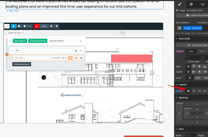
Actually I think changing the display from inline to box (the first one) fixed the issue for some reason for me. Try this if you are having trouble!
Hi Khiara,
Is this fix still working for you?
I changed my display to box as you advised and I am still having trouble. Sometimes it publishes and looks like it is fixed, only to ever back to tiny images upon refresh.
My images are in a grid layout but affected the image itself to box.
I’ve been having exactly the same problem - for the time being changing from inline to box seems to have worked.
all the best - this place is great (I’m a real newbie!)
Jono
In recent versions of this I’ve seen the problem appears related to responsive images. I see them created often with a current size of 1vw, which is 1% of the screen width.
You may be able to re-generate the responsive images, or just disable them to solve the issue. Alternatively it might be related to a calculation bug when it cannot determine the size of the container at the point of responsive image generation - sizing those containers, giving the images 100% width, and then regenerating them might help.
Make sure to always define the width and height of the image. Leaving the width or height property empty or as auto can cause strange issues like this.
Hello! For us its helped to wrapping image in div block ![]()


