Hi! I’m fairly new to webflow (Ive been on it for a couple of weeks now) and I’m trying to make my website responsive to any size, but my main page has (mostly) all images
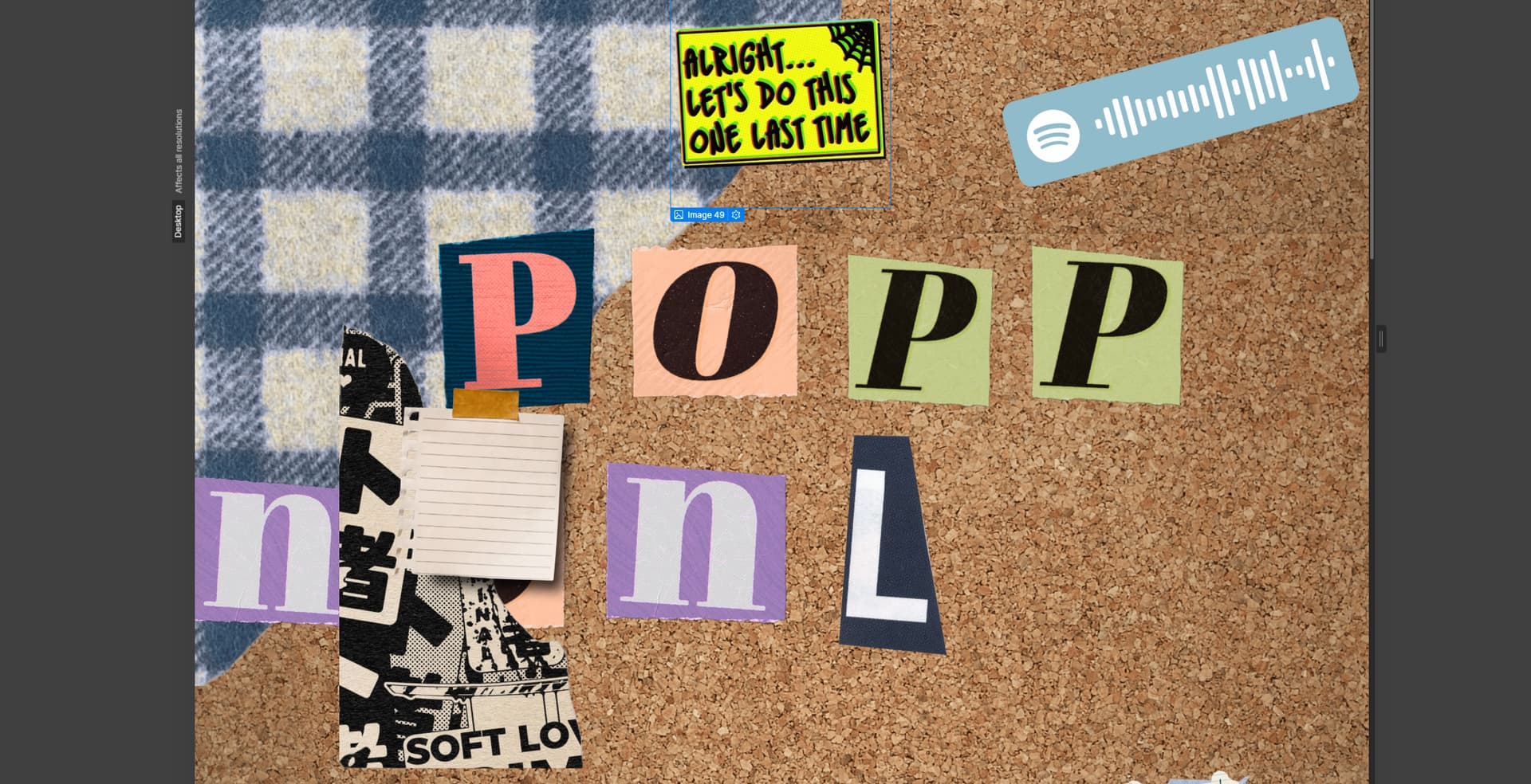
I’ve replaced most of the images with random ones on my pc just to see the layout of things:
the images get smaller at some point but they don’t retain its “structural integrity” and I have been searching for days on how to solve this. I’m also worrying about the animation aspect of things where everything’s going to get messed up when I change sizes. Any help would be greatly appreciated! -sincerely, a lost webflow user
Webflow automatically handles responsive image optimization by creating variants of your inline images that load efficiently across different devices. This ensures optimal performance while maintaining image quality across all viewport sizes.
For inline images, the system automatically generates these responsive variants from their normal states. However, if you’re working with images that have hover states or interactions, keep in mind that responsive variants are only created from the normal state - you’ll want to review your site thoroughly after adding any interactions to ensure everything displays correctly.
Background images work differently - you’ll need to manually upload variants for different breakpoints as these aren’t automatically optimized by the system. To maintain proper content structure, use Sections with Containers, and regularly test your design’s responsiveness by resizing your canvas to different viewport widths in the Designer.
If you need to refresh your image measurements, use Command + Shift + I (Mac) or Control + Shift + I (Windows) to scan and re-measure all pages on your site.
Hopefully this helps! If you still need assistance, please reply here so somebody from the community can help.