my website is doing something weird. The Body width is suddenly fixed by the browser. Then when I run it in to different desktop,the content goes to the top left side of the page. I honestly have no idea what I did. And I tried looking the forums for any answers but to no avail. So I’m reaching out to you good folks to help me out. Please I have to finish building the website in 2 hour help me asap
Hello @Feben_alebe, welcome to the community!
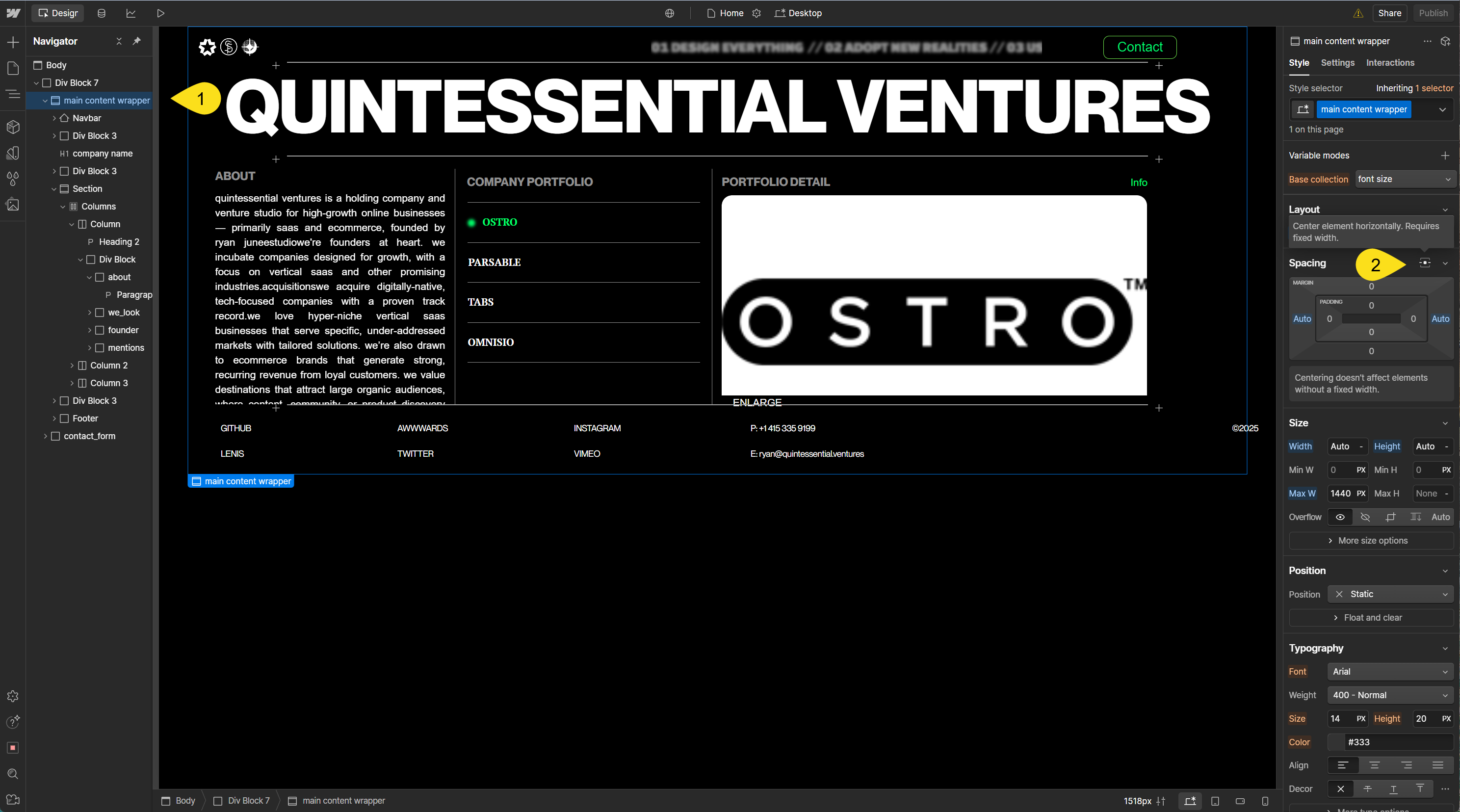
The problem that you have is with your main content wrapper container because it has a max with but it is not centered, simply give it an auto margin on both sides

I hope this helps
it works thanks alot
1 Like
Hey there,
here I am again.It previously worked in my pc but when i checked it in other pc,the content is on the half of the pc.And it is the same again when i zoomed out.can you help me
I don’t know what this means- do you want to add screenshots?

As in increasing your section height?
Generally web pages are designed to scroll vertically so they can respond to different browser window sizes and screen widths.
You’d just make your elements larger, adjust font sizes, content, image cropping.
If you’re unfamiliar with layout techniques, Webflow has a 21 day course which might help you with some of the layout principles and tools you’ll use for this.