I just started out with webflow and have been watching about 1 1/2 hours + of webflow university content.
I have two questions concerning the canvas settings:
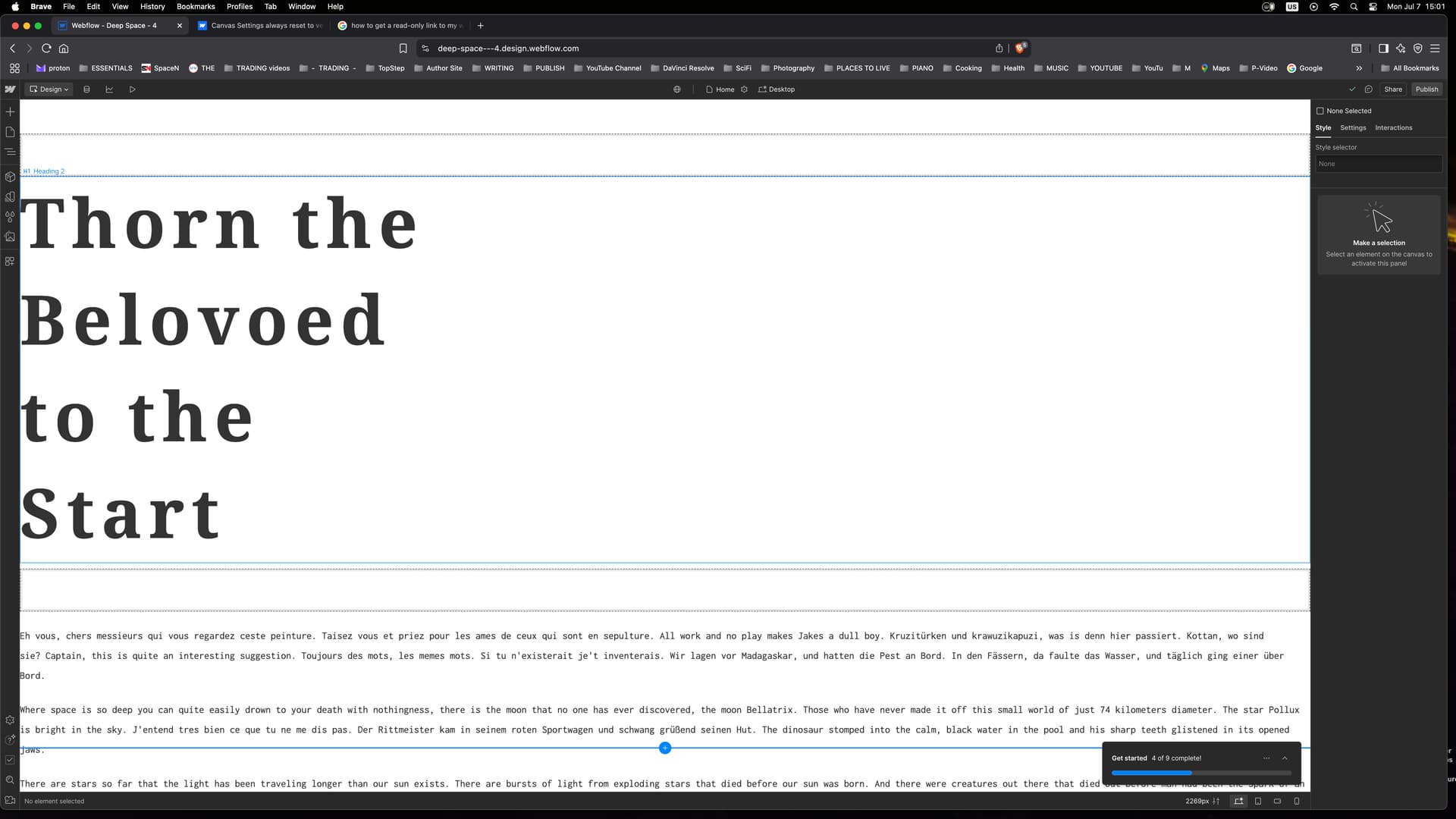
Why does my canvas always reset to 2269 pixels width? I enter a smaller number, e.g. 1920 px and the next time I open it is again at 2269 pixels.
I have entered different amounts in my first attempt on a website (I’m currently at attempt 4) and this seems to have disturbed the system somewhat. How can I fix this?
I would like to have some kind of orientation what the viewport looks like on a desktop, e.g. have a line where the 1920 x 1080 pixel field ends so I can design for the opening of the viewport.
I can’t include a link to the website I’m working at as I am just deleting attempt 3 because it didn’t work. That background image of Andromeda with text going across was too busy and I’m going now all minimal as I like minimalist approach best.
Regarding your canvas width resetting to 2269px, try these troubleshooting steps:
Clear your browser cache and reload Webflow
Check if you have any custom code that might affect canvas settings
Ensure your project’s default breakpoint settings are properly configured in the Settings panel
For viewport orientation, Webflow’s rulers are excellent tools for maintaining alignment across different screen sizes. Enable them through Canvas settings by selecting either “Pinned rulers” for horizontal reference or “Pinned ruler & crosshair” for both horizontal and vertical alignment. You can also preview your design at different viewport sizes by entering specific widths (like 1920px) in Canvas settings, which helps ensure proper layout across various devices.
Hopefully this helps! If you still need assistance, please reply here so somebody from the community can help.
The canvas width isn’t that relevant to what you’re building- the breakpoints are.
Start your design on the desktop (aka base) breakpoint, then apply styling changes to other breakpoints working outwards from there.
IIRC desktop is 992px and higher. If you add larger breakpoints you can target larger breakpoints specifically if you want to.
It’s possible that browser zoom or a base font system font size could affect measurements, but I wouldn’t expect it. Browser extension interference is a more likely scenario.
Create a blank site and see if you have the same problem. Try the same with all browser extensions off. If you still have the problem and cannot identify the cause, I’d open a support ticket.