Hi, I am looking for a little best practices feedback.
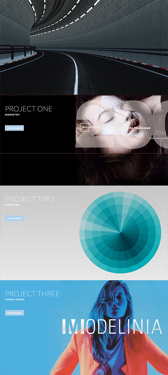
I’ve got a 2 page site (very much under construction). The 1st page uses the default video background in 1st section then there are 3 sections below it where I have placed am image with a z-Index of -1 then type blocks that overlap the image.
Using this approach I’ve customized the top margin of each project image and the text blocks so that the images ‘stack’ properly (don’t overlap). It’s quite a fiddly/time consuming approach and I’ll have to customize the margins for mobile/tablet etc. The end result/layout for desktop though is the result I’m looking for.
Is there an easier way to achieve this layout? I’ve no doubt my approach is not standard/best practice, shows my novice skill set, and my beginner knowledge of CSS. I am learning as I go here. I have watched the webflow tutorials and this is a work in progress/ practice site.
Hi @PageMill_1_0, Can you please update your post with specific designs/screenshots so we can help you faster?
At first glance, my advice would be to treat z-index similar to how you treat layers in Photoshop - instead of going “-1”, try increasing the z-index of other elements.
Thanks! - I’ll try giving the other elements a +1 Z-index. It does seem more work to assign a Z-index to all the elements on every section rather than just give -1 to the image. But if it’s a better web practice then I’ll do.
I’m also attaching a jpg mockup of design (using webflow default video in top section).
Maybe another way to understand what I want is to view this site:
This site has a splash video that resizes to fill the browser window. Below it are jpgs 1920x1080. Each jpg is for a specific project and resizes to fill the browser window (but you always see 100% of the image). Clicking on the button on the jpg takes you to a page with a vimeo player that fils the screen and has jpgs below it. Very similar to what I have in my share.
Again my real question is this - What is the best practice for building? Should I be using images the way I am with the buttons and text overlapping Z-index? Or is it ‘cleaner’ code to build using the image as a background in a section?
If the answer is both approaches are fine, that is ok with me. I just want to know that I am building in a way that makes sense and is the easiest/best approach for what I am trying to do.