The layout of my site looks fine when I preview it on webflow’s editor however it is really wonky when I look at it on my iphone (i’m using an iphone x)

Anyone know what the problem is?
Here is my site Read-Only: LINK
The layout of my site looks fine when I preview it on webflow’s editor however it is really wonky when I look at it on my iphone (i’m using an iphone x)
Anyone know what the problem is?
Here is my site Read-Only: LINK
Hey,
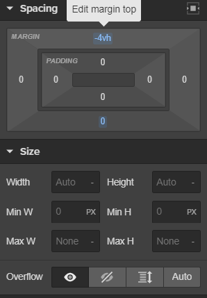
for me it looks very similar in Webflow’s editor as it does on mobile (your screenshot).
It looks like it mostly has to do with your negative margins:
Hmm should i not be using negative margins? I was having issues displaying the footer in the screen hence the use of the negative margin
