Mobile nav weirdness

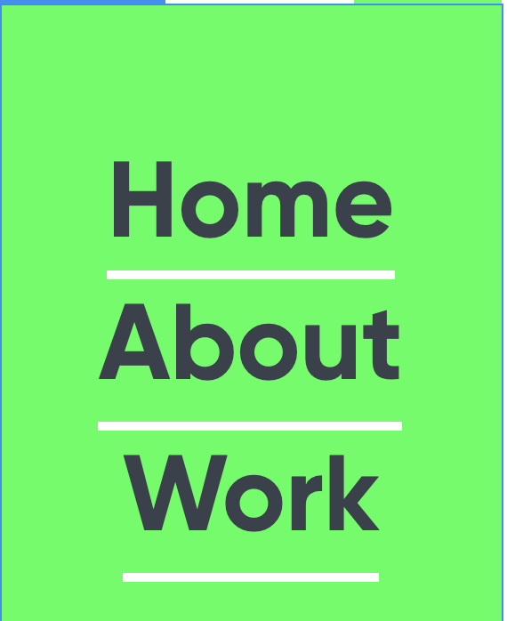
Having some consistency issues with the mobile nav. In Webflow it all looks as it should, when I view on my mobile the Home link has big margin after it. Everything seems to look the same in Webflow with regards to margin, padding etc.

Anybody come across something similar?


Here is my site Read-Only: LINK
(how to share your site Read-Only link)
Can you share your read only link and published site please?

https://preview.webflow.com/preview/jamie-gregory?utm_medium=preview_link&utm_source=dashboard&utm_content=jamie-gregory&preview=c5305cfca400d10933f82925849d8e94&mode=preview

if you go to the mobile breakpoint you will see the wrong spacings too. Just fix it for that breakpoint in the designer.

Here is what it looks like:

1 Like

That’s great, thanks