I never used to have this issue before but I just created a unique navigation bar for just my homepage and now on tablet and mobile view, there is a horizontal ability to scroll with about an inch of white space on the right. This didnt used to be there. The weird part is when you scroll down on the page, by the time you reach the footer, it snaps back and the whole page is fine. Is it a glitch? Additionally when in preview mode, and moving around the navigation, it wont take me to a certain page, but rather to a webflow default page where i have to get out of design mode and then log back in. What’s up with that?
Hi @shedlightphotography, it looks like there is some overflow on one of the text headers in the mobile layout. That overflow causes the horizontal scroll and white space.
I would recommend to reduce the size of the font and then see if that helps.
I gave that a shot and it didnt seem to be the issue. I am still getting the over flow. Also it isnt just on the portrait mobile, it is on the tablet and both mobile versions.
Hi @shedlightphotography, thanks for the update. Yes it seems you do have extra overflow. I did not notice it right away, because the overflow was only happening at page load, not in the designer
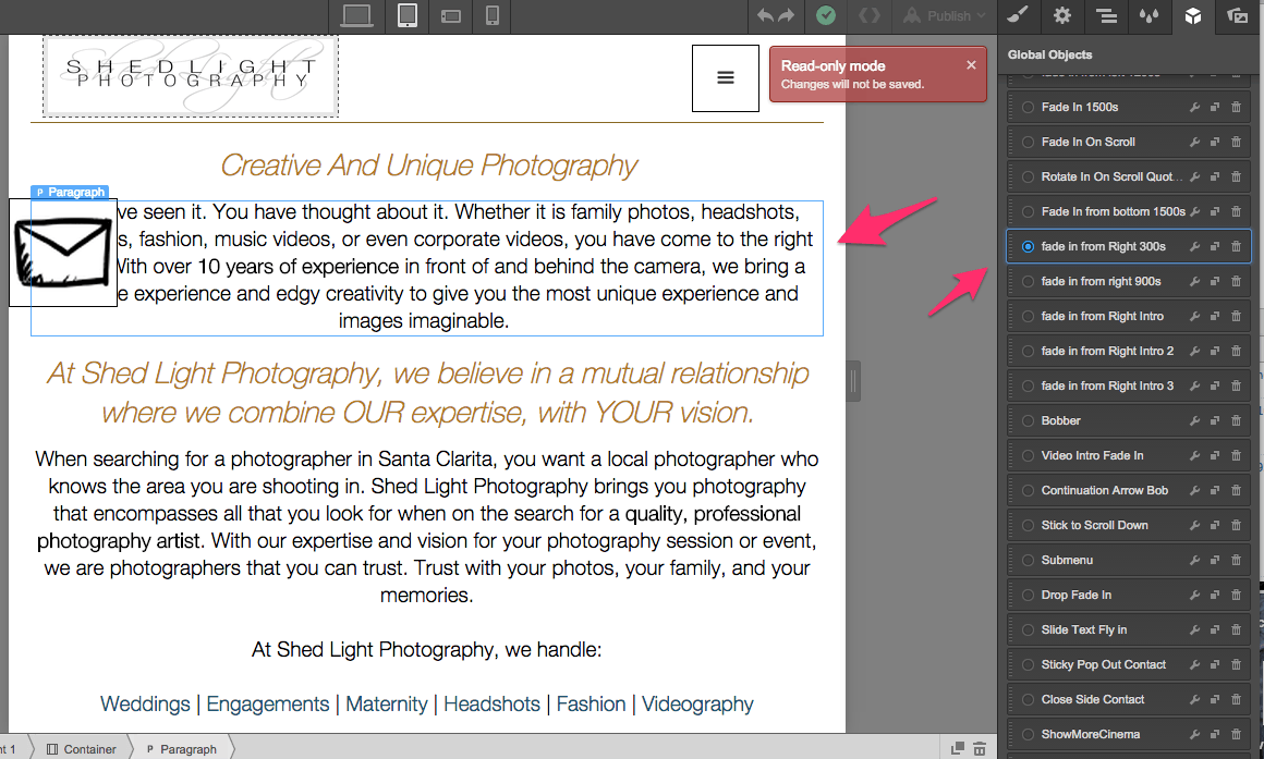
Seems you have an interactions on some paragraph elements with an initial appearance of Move Right 100px, which is causing the overflow. You cannot see it in the designer, because the Move Right 100Px is set as an initial appearance.
If I check each Paragraph (some have different interactions) and make sure that the Move Right 100px initial appearance is removed, then the issues seems to go away for me.
that makes sense Dave. Nice catch! Is it possible to turn off the interactions on the smaller devices? Similarly to how you would adjust the CSS parameters by device?
Hi @shedlightphotography, thanks for the question At the moment, it is not possible to selectively disable interactions on mobile devices.
What you can do is to create a duplicate of the item having the interaction, and then set the visibility of the elements, so that the element having the interaction is shown only on desktop, and the other element without the interaction shown on mobile views (tablet and below if you prefer).
You can change the visibility of an item from the Settings panel.
I hope this helps. If not, please let me know – I’m happy to assist further!
