Hey CampingGirl,
Nice site, well done! I’ve listed a few thoughts, but bear in mind I’m just one person and many of these will be personal opinions - you / other people may disagree, which is totally cool!
- You don’t seem to have used hover effects for any of your links/buttons. Tasteful hover effects can really improve the UX, in my opinion. Even just a subtle change in opacity on hover, or even a full colour change can look fantastic! For example, hover over the Webflow logo in this very forum. Really draws your attention to the fact that you’ve moused over a clickable link, right?
- I noticed that your links change colour if they are the Current page, which is great. However your About Us link does not - not sure why this is.

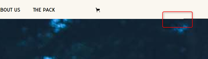
- There’s something going on here - some sort of navbar height issue or border?
4. On the page /gear your Blanket link is underlined in blue, whereas the other products are underlined in black.

5. The layout here looks weird - nothing lines up...

- I’m a big fan of the colour scheme you’ve got going on, I think it fits the subject matter of the site perfectly. Muted and Autumn-y.
- I know this won’t be on the final site, but it made me laugh!


I hope this is at least a little bit helpful, and I don’t mean to be too critical. It’s lovely to look at! ![]()