Hi everybody,
I designed and built a website for my camping company and I’d love some feedback on the UI before I do any more work on it and add in some more complicated stuff!
It’s my first Webflow project and my first UI project so it’s been an interesting journey. Most of the text and images are FPO and the only fully designed product is ‘Tent A’. I know some of the UX isn’t right, I’m more concerned with the UI rn.
Here’s the published live site: https://outwhere.webflow.io/
Thank you very much for any feedback!
1 Like
Hey CampingGirl,
Nice site, well done! I’ve listed a few thoughts, but bear in mind I’m just one person and many of these will be personal opinions - you / other people may disagree, which is totally cool!
- You don’t seem to have used hover effects for any of your links/buttons. Tasteful hover effects can really improve the UX, in my opinion. Even just a subtle change in opacity on hover, or even a full colour change can look fantastic! For example, hover over the Webflow logo in this very forum. Really draws your attention to the fact that you’ve moused over a clickable link, right?
- I noticed that your links change colour if they are the Current page, which is great. However your About Us link does not - not sure why this is.
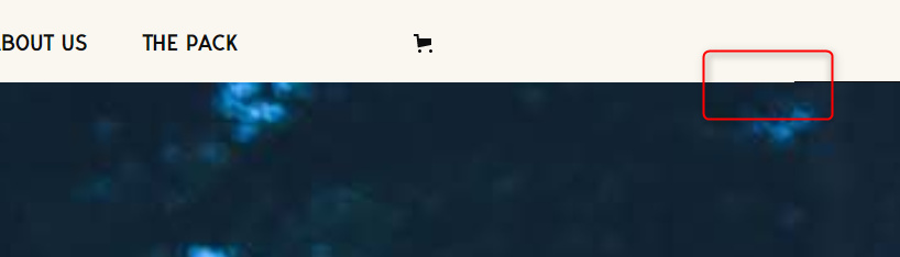
- There’s something going on here - some sort of navbar height issue or border?
4. On the page /gear your Blanket link is underlined in blue, whereas the other products are underlined in black.
5. The layout here looks weird - nothing lines up...
- I’m a big fan of the colour scheme you’ve got going on, I think it fits the subject matter of the site perfectly. Muted and Autumn-y.
- I know this won’t be on the final site, but it made me laugh!


I hope this is at least a little bit helpful, and I don’t mean to be too critical. It’s lovely to look at! 
@Andy_Vaughan
Thank you so much! I’ll work to change those items based on your suggestions.
In reference to the blog post alignment, it’s not lining up because the title ‘Advanced Shivering Theory’ is 2 lines long. Do you have any suggestions on how to make the posts stay the same height/next line start at the same place regardless of the content size? It was doing it with products when there was a variation option too, so I hid the variation.
I’ve tried to adjust the % and VH but to no avail.
I’m glad that line made you laugh! Our goal is to teach people how to camp in a fun way, so good to know the tone is right on that one!
Please, only change them if you agree with them!
I’d need the read-only link if possible to give you advice on the blog post alignment, as I’m not sure how you’ve got it set up at the moment. I’m sure I can suggest the solution though, as I had a similar issue with my own project recently!
Oh, I agree with them! Some of them I’d noticed myself, but had forgotten in the process or just given up on.
here’s the read-only link
Ok so you could define a set height for the element Blog Post, flexed vertically and justified with space between. Here’s how that looks at a set height of 450px (you would need to play with other breakpoints, as well as be strict on how many words made up your post summary / titles if you’re using a fixed height):
It doesn’t look ideal yet in that example above, I’d still tinker until EVERYTHING was in line. But it’s a good start.
Another solution would be to use Grid, as it would automatically set to the height of the largest example of Blog Post within it.
Thank you @Andy_Vaughan!!!
I was able to play around with it and get it look good on all breakpoints!
Working on a few other issues in the site, but I will get to all your suggestions.
1 Like
Awesome! You’re very welcome, I hope it all goes well for you