Is it just me or is the mobile landscape design just not accurate? When I develop in this breakpoint it’s fine but when I go to test in mobile, it goes by the tablet design, which is so odd. For reference, I have an iPhone 13 Pro Max. It makes designing for this breakpoint so frustrating because I feel as though I’m wasting time because it’s not going to look like how it does in the breakpoint.
Is this a bug or am I just doing something wrong?
It depends. We’d need a hint about what’s going wrong with your design. Through a text description, screen grab, screencast, and your read-only share link.
One common issue is that you’re designing on a desktop computer which will show a deep view of the landscape layout, while viewing on your iphone 13 pro max will only show about 430px deep.
One thing you can do is shorten your browser while working on this view or use the FiNsweet Chrome extension which has a vertical screen resize option.
Thanks for the response,
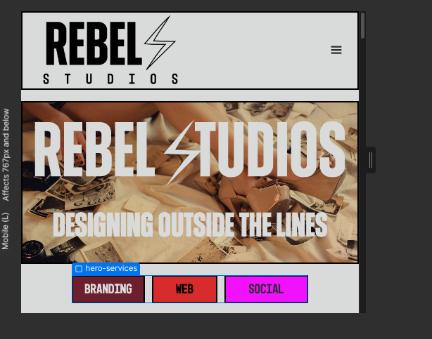
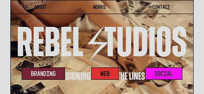
I downloaded the Finsweet extension (which by the way, the vertical resizing is a game changer, so cool!) but I’m still running in to the issue of my mobile landscape stemming from the tablet design. I have attached some photos for reference. First photo being what it looks like from Webflow and second is a screenshot from my iPhone.

Read-Only: Webflow - Rebel Studios
Shoot. Wish I could help but this leaves me confused. It should be showing the mobile menu at this width and even on tablet view.
I checked your live staging site on my iPhone 13 and it looks correct. I can’t think of why this would happen unless there’s some zoom feature within the browser you’re using, Something that triggers the desktop menu to show rather than the mobile menu. Seem unrelated to Webflow platform but I can’t say for sure.

