Hi. I am having some difficulties with mobile landscape view on live.
It’s all good in webflow designer but when I go to live on my phone landscape it’s not responsive at all.
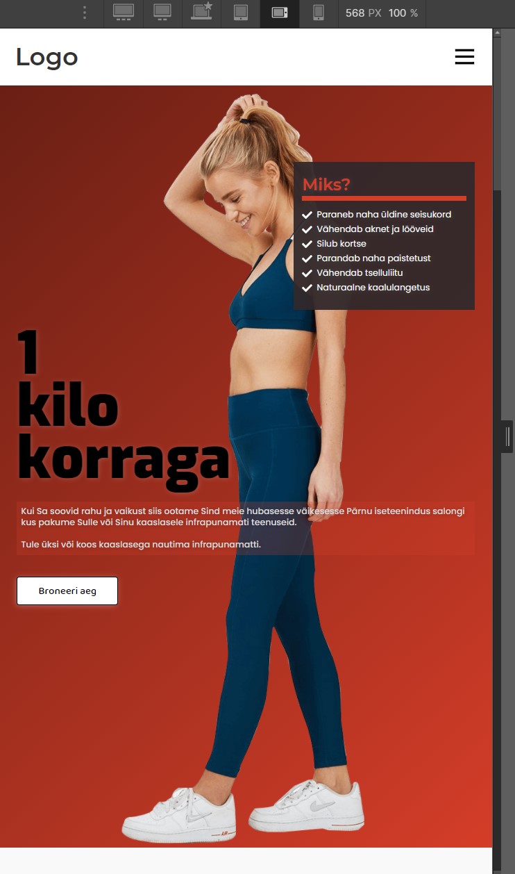
What I see in designer:
and now what I see live on mobile landscape:
Does anyone have a solution for that or could tell me what Im doing wrong?
thanks
Link: https://preview.webflow.com/preview/oves-five-star-project?utm_medium=preview_link&utm_source=dashboard&utm_content=oves-five-star-project&preview=200808886d165472b9c6530cfdb03487&workflow=preview
If your site doesn’t have a mobile version, google’s mobile friendly algorithm will filter your site, which means your site will only appear on your PC’s web browser. you can refer at this website: https://soundcloudtomp3downloader.net/
I think that the most likely reason that you see a different version on your mobile than Webflow’s “Mobile Landscape, 767 px and down” would be that the mobile you’re using has a screen that is larger (i.e. more pixels) than that. So, it would be showing the Tablet or Desktop layout.
Webflow’s naming of the breakpoints is misleading, because this isn’t based on the type of device but on the size of the browser window!