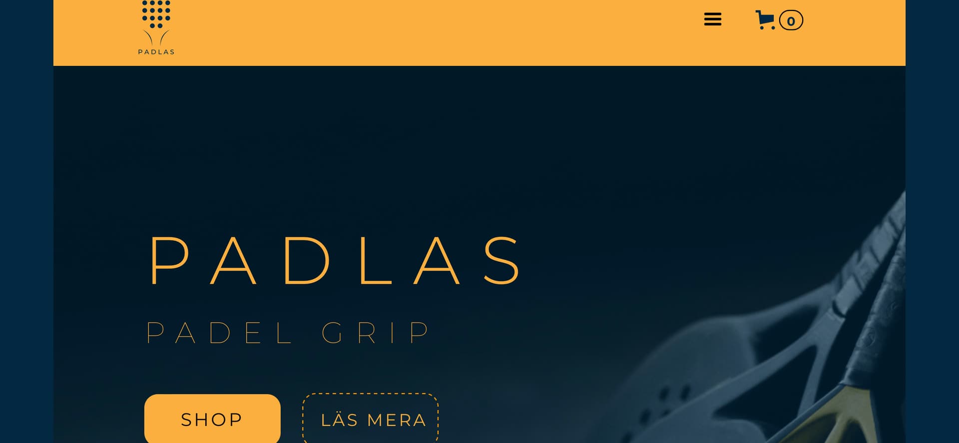
I have a problem with the mobile landscape view on a website that i’m trying to design.
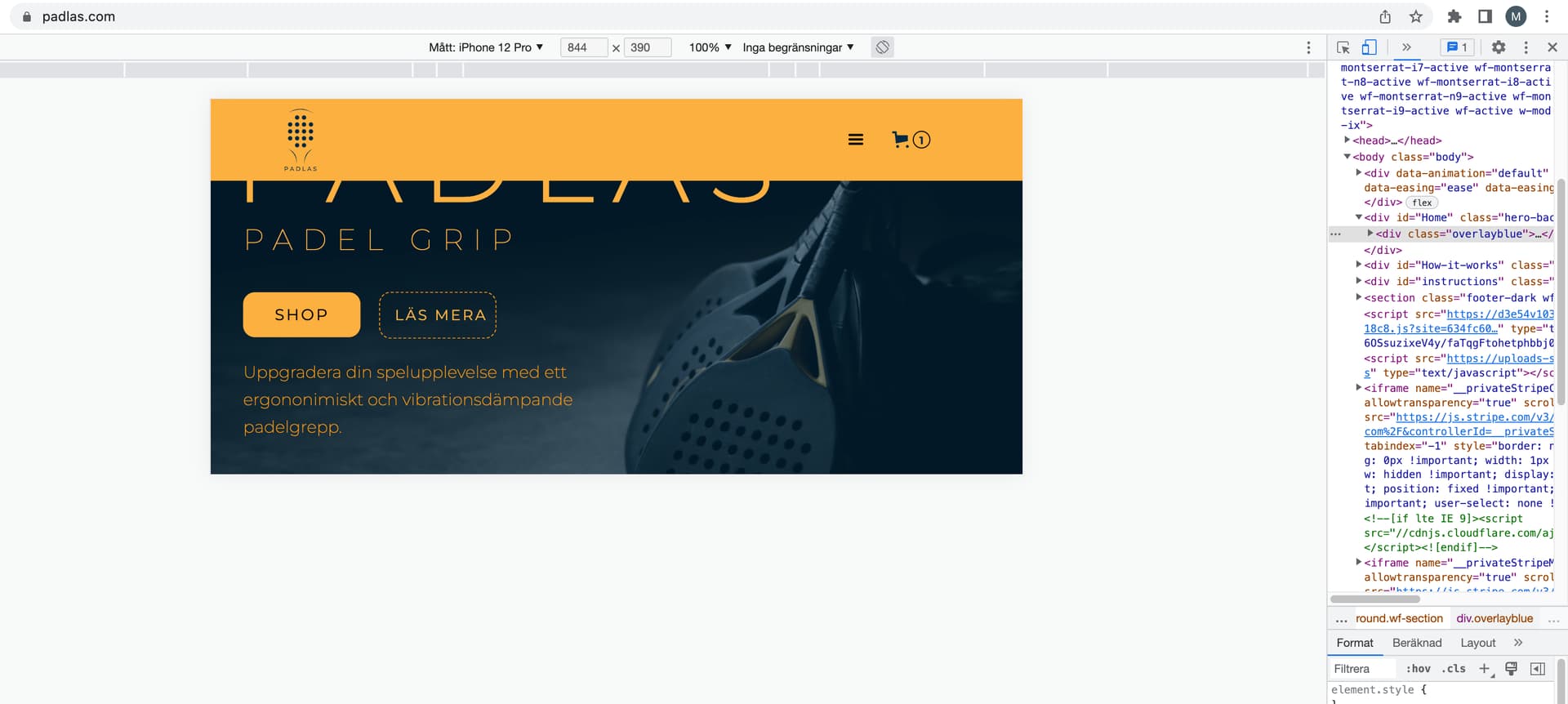
The design and the preview in webflow looks nothing like the actual layout on mobile landscape and completely different from what is seen when inspecting the design with google chrome across all breakpoints.
This seems to be a very common problem with webflow and there are quite many unsolved topics here in the forum created by people that are facing the same problem.
The whole workflow becomes a time consuming hit and miss process and I just want to confirm that this is all beginners mistakes and if not, then it’s just not worth it considering all the available alternatives out there.
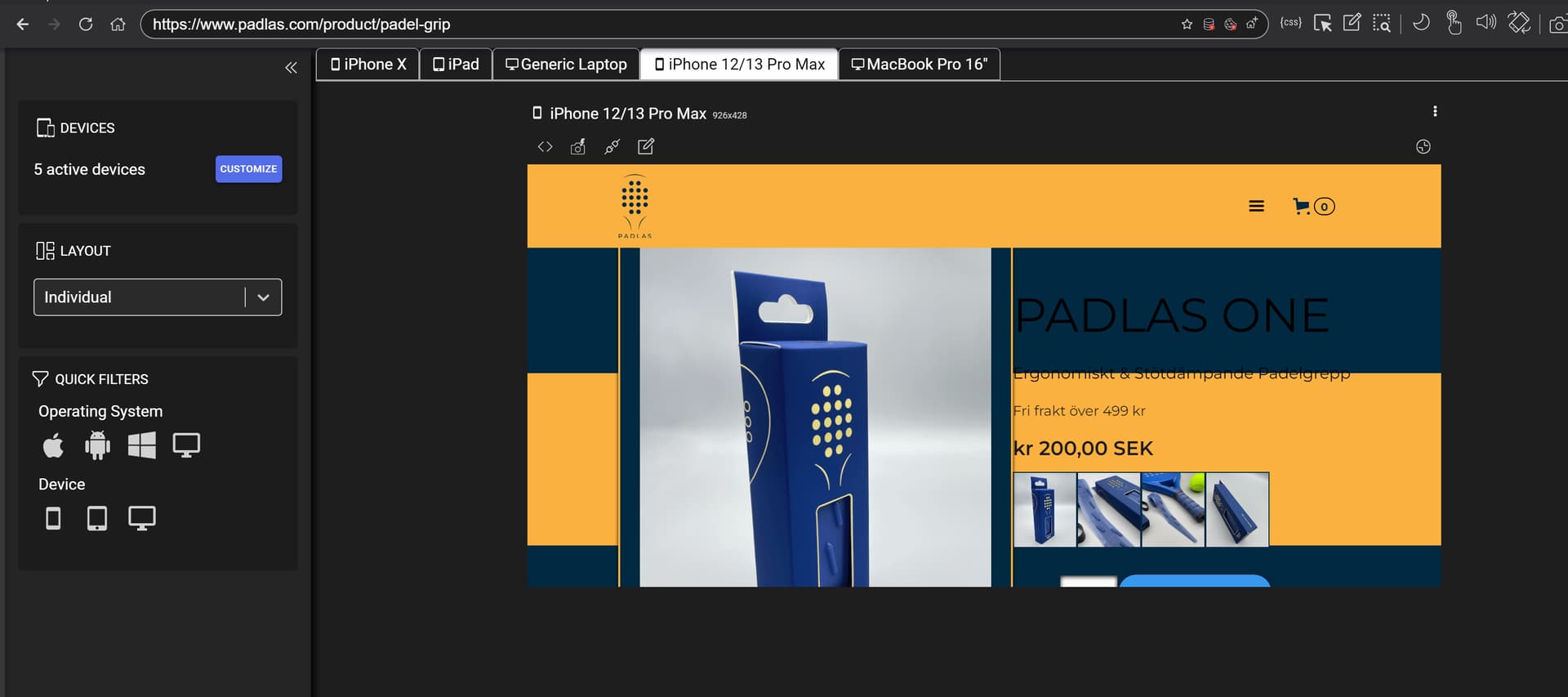
hi @Musto your live page padlas.com is password protected so without access to see website there is no way to help as it can’t be checked on real devices. These software emulations are unreliable and you should not use these. if you would like to use software you can try ResponsivelyApp.
Have been on your website few times to figure out what the problem is and to help if I can - now I understand. I don’t think you can have different images for mobile landscape and portrait. I wanted to do that myself, but some of the moderators here said that it’s not possible. Out of curiosity, did Web flow suggested some alternative solutions, because I would like to use your approach.
The one way to do that (change image) with CSS only is set two images and hide one and set query to do opposite (hide visible and show hidden) on landscape.
but this is not this case as issue @Musto have is with partially hidden element under nav and here on forum is many solved issues how to. but it need to be checked on real devices if it is issue as these browser emulations are not reliable. One that is IMO usable is in Safari but even that still checking on devices is the best bet.
Are you able to access my design now? I have removed the pwd protection but unpublished the website (not sure if that works) because i’m trying to limit the access and also because I have not done any SEO work (meta descriptions etc)
Seems to only be an intel based Mac version of the tool available and I have an apple silicon mac, cannot get the app to work properly (starts but nothing else happens appart from the icon showing in the doc bar), however it worked just fine with parallells and the windows installation file.
hi @Musto I have now checked your WF site and you a have common mistake setting height: 100vh All you have to do is to change your hero background and overlay to min-height: 100vh instead.
this should solve your issue but I can’t confirm it as you site is still under password protection.
I wrote the pwd in an earlier post but forgot to tag you in it. The password to the website is “webflowforum”
Your suggestions seems to have solved the overlapping elements on the hero section. Now I have overlapping elements on instructions and how it works sections, will experiment with view heights.
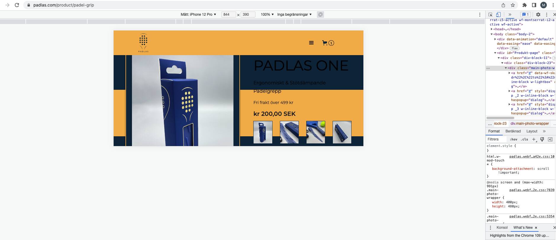
I noticed something very critical that I have kinda missed and noticed it when I started using the responsivelyapp. The breakpoints for desktop/tablet/mobile in the webflow designer do not represent the actual screen sizes on the mobile devices that I’m using (Iphone 12 pro, Ipad pro 9.7" 2016).
So the changes that I do on tablet in webflow are actually also introduced on Iphone 12pro simply because the resolution (perhaps pixel density) is so high that the iphone 12 pro is actually part of the the tablet category in webflow designer.
hi @Musto I’m glad that setting dynamic height instead fixed solved your issue. You are right the WF breakpoints are let say “vintage” but still can give some basic overview of design on different devices. It is great you understand screen resolution and pixel density where most no-code “developers” struggle.

