Wondering if anyone has noticed this issue and has come up with a solution. For the longest time I’ve been trying to understand why my website designs keep reloading when I resize the browser or toggle my phone between portrait and landscape. This becomes noticeable and in a way looks unprofessional when a website has a loading animation, which replays when I toggle between different breakpoints. Most websites that I’ve come across don’t behave this way, meaning that unless I refresh the browser their loading animations play only once, regardless of how far I manually change the browser size. What’s even more frustrating is that some other elements such as slider animations and position of elements also fall apart and appear faulty, unless the browser is refreshed and its size stays the same.
After countless hours spent experimenting and adding/removing elements, I finally figured out why this happens. Not sure if it’s a webflow bug or not but basically it all has to do with “triggers on breakpoints” being checked on or off. If I have an interaction that’s meant to play on all breakpoints, meaning that its trigger settings are checked on all desktop, tablet, phone landscape, and portrait breakpoints then the website behaves normal, page intro animation plays only once, and all elements behave correctly no matter how far in/out I drag the browser. However, if there’s even one interaction in an entire website where its trigger is checked off on either one of the breakpoints, then the website replays the intro animation and elements fall apart upon resizing the browser.
I’m sure we can all agree that this is beyond frustrating as most of us would like to have interactions play only on certain breakpoints. If for example, I was to add a horizontal scroll interaction on a section for desktop, but have the section scroll vertically on mobile, I would style that section accordingly for each breakpoint and set the interaction trigger to ON only for desktop. This way the browser reloads on different breakpoints. To prevent that, I’d have to set the trigger ON for all four breakpoints but then I’d be stuck with a horizontal scroll interaction all the way.
To demonstrate this, I’ve included two separate sample projects here:
1) IX trigger ON for all breakpoints:
Here, on the “Hover-Wrapper” div block, the mouse move animation trigger is CHECKED ON on all 4 breakpoints. The loading animation only plays once regardless of the breakpoints you enter. The website behaves as it should, but it has the limitation of applying ALL interactions on ALL breakpoints, thus choking one’s creative flow!


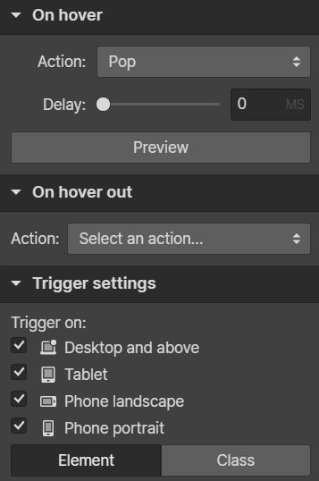
2) IX trigger ON for desktop but OFF on other 3 breakpoints:
Here, on the “Hover-Wrapper” div block, the mouse move animation trigger is CHECKED ON for desktop and OFF on all other breakpoints. The loading animation plays every time the browser is resized to a different breakpoint, which is annoying and has bad UX all around.


Another instance where this problem becomes a pain in the butt is when for example the viewer clicks on a lightbox element to view a gallery on mobile portrait. The lightbox opens on top of everything else. Now if the viewer wants to get a better look at the pictures by flipping the phone to landscape, the lightbox stays on top but behind it the website reloads.
Sorry for the length of this post but I wanted to make sure that the issue is thoroughly explained. Having to apply interactions to all breakpoints to avoid running into this issue is definitely a major problem. Hope someone has a solution to this. Thanks in advance!


