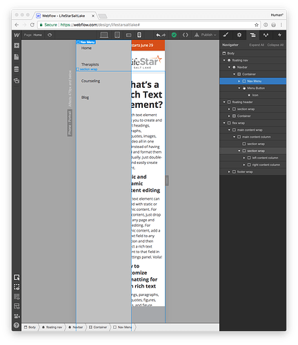
I have a great navigation concept that I’d like to accomplish with the default Navbar solution… everything seems to work, except in the real world! In mobile states, my Navbar is sticky to the bottom and I’d like the Nav Menu to type to be “Over Left.” Some visual examples:
-
In Webflow Designer (works):
-
In Chrome Emulation (works):
-
In iOS Chrome (FAIL):
See how the light gray menu is open on the bottom, but not visible horizontally in the browser?!
-
In iOS Safari (FAIL):
Tapping on the place where the menu items should be overlain on the screen actually flashed their box on both mobile browsers
I’ve tried a number of tweaks (Z-index, absolute/fixed), and I can’t seem to fix this!
Help!
I’m sure this could be a very useful UX pattern based on research from LukeW idealized in this graphic:
Here is my public share link: https://preview.webflow.com/preview/lifestarsaltlake?preview=8b7c7438eded88e61ace90b00e10664d


