Hello all,
I’ve been having a persistent problem. I’ve got a certain effect achieved with custom code where the grid on my home page that contains all of the images for my portfolio work distorts (skew, stretch, and perspective rotation) after it reaches the top 20% or so of the page. I used two copies of the divs containing the grid and the custom code positions and distorts everything and handles page scrolling.
The issue is that, sometimes, some of the images in the distorted portion decide to resize themselves. Sometimes in both the editor and on the live page in my browser, sometimes on one or the other only. Sometimes it fixes itself out of the blue, and sometimes in breaks likewise. I’ve shown some people who didn’t seem to notice any particular issues, but I wasn’t able to verify by looking at their screen nor discussing it with them in detail, and it was a small sample size.
Here is how the effect should look:
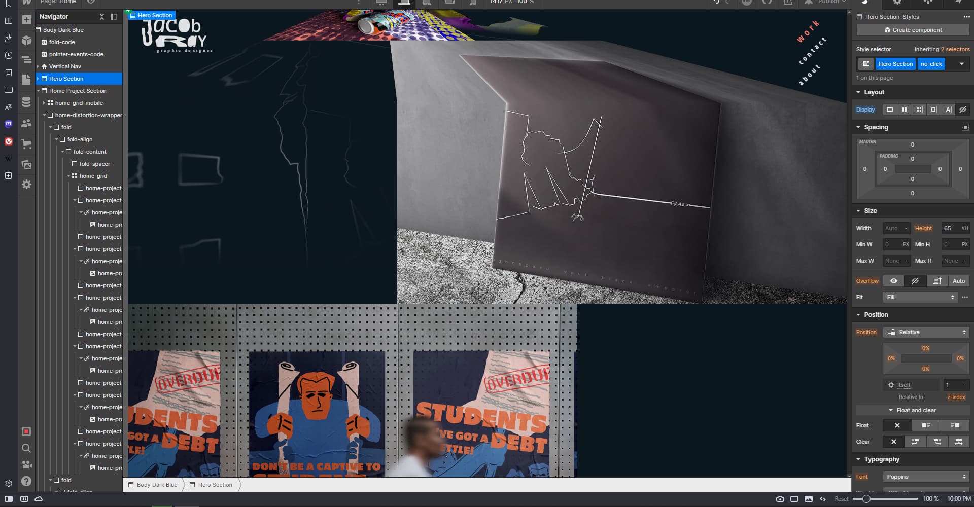
And here’s how it actually looks (when it feels like it):

At the bottom of the page is my read-only, but because the scrolling is handled through custom code, you can only actually scroll in the editor by changing the vertical position of the “fold-content” div, so here’s a link to the live site as well to make it easier to analyze the scrolling behavior:
This has been a constant thorn in my side and I’ve tried everything short of an 8-ball and an exorcism. I hope you fine folks can help me here, you’re my only hope.
Here is my site Read-Only: LINK