I need advice/help with the responsiveness of my site.
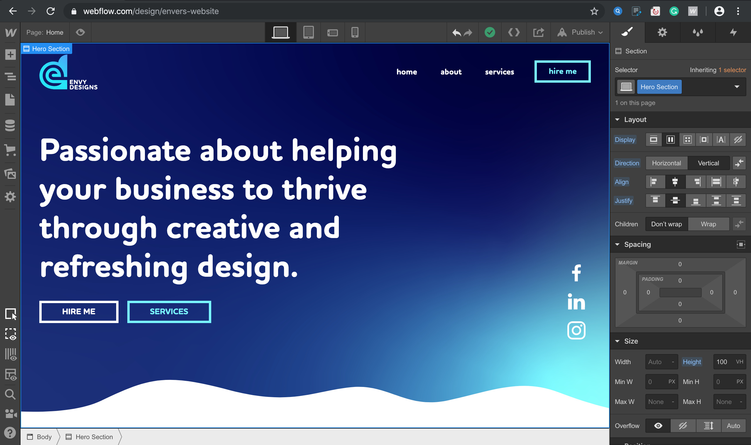
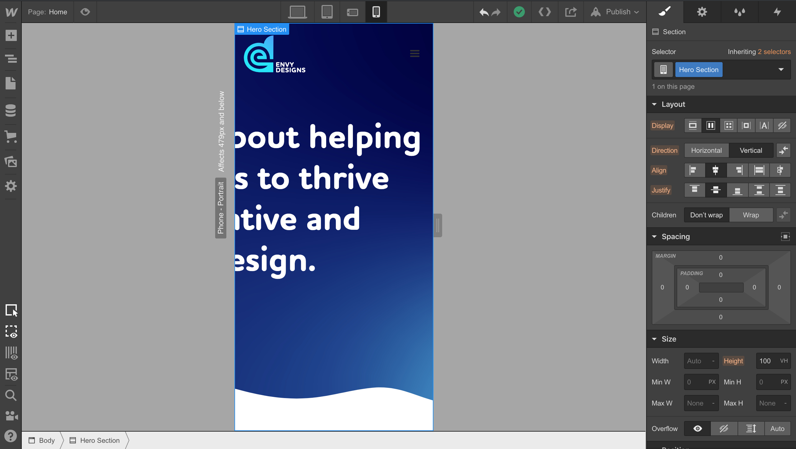
I have finally finished designing my website (almost). I’m new to Webflow, I’ve finished the visuals of the site for desktop view, I went to begin designing for mobile view but as you can see in the screenshots a huge amount of elements are missing from my viewpoint, If I can’t see them then I cant re-arrange or re-size them to make them responsive for this view.
Hi @Enver_Mehmet
It looks like @QA_Brandon already covered most of this very well. I like to recommend you to work with Webflow’s native container element - it is already responsive:
Looks like I still have so much to learn in Webflow
Thank you for taking the time to introduce me to some tips, I just have a few questions out of pure curiosity whilst I have your attention!
I know nothing about the whole ‘wrap’ tool in webflow, is there someplace I can learn more about this?
When I design a website from scratch should I constantly be thinking about the responsiveness, flicking throughout each view to see how it looks, or can I wait till the end and adjust it from then?
Thanks for the feedback, am I right in saying that if I move all my content (within each section) into a container instead of a div that it will automatically be responsive (with a few adjustments etc).
I’m new to Webflow but I think I’m right in saying that I wasted a lot of time using divblocks as a container, because I now have to re-arrange everything. I was kinda under the assumption that Divs and Containers were the same
So, the difference between a container and a div is that a container comes pre-equipped with responsiveness?
As far as building responsively, my workflow is to keep it in mind at all times. Especially on a per section or page basis. Usually I will build a section then do my trickle down responsive setup or I may way til the end and just do it all at once, per page. Depending on the length and amount of content in the page.
As for your second set of questions: IMHO, I would not use the container and build your “Own” containers based on your design workflow. TBH, I have never used the container element in a project.
Please let me know if you have any other questions,