I’m a Webflow beginner (<4 months). I have mostly worked on Squarespace up until this point, when one of my new clients came to me with a webflow site. I’m slowly learning the ins and outs but can’t figure this out for the life of me.
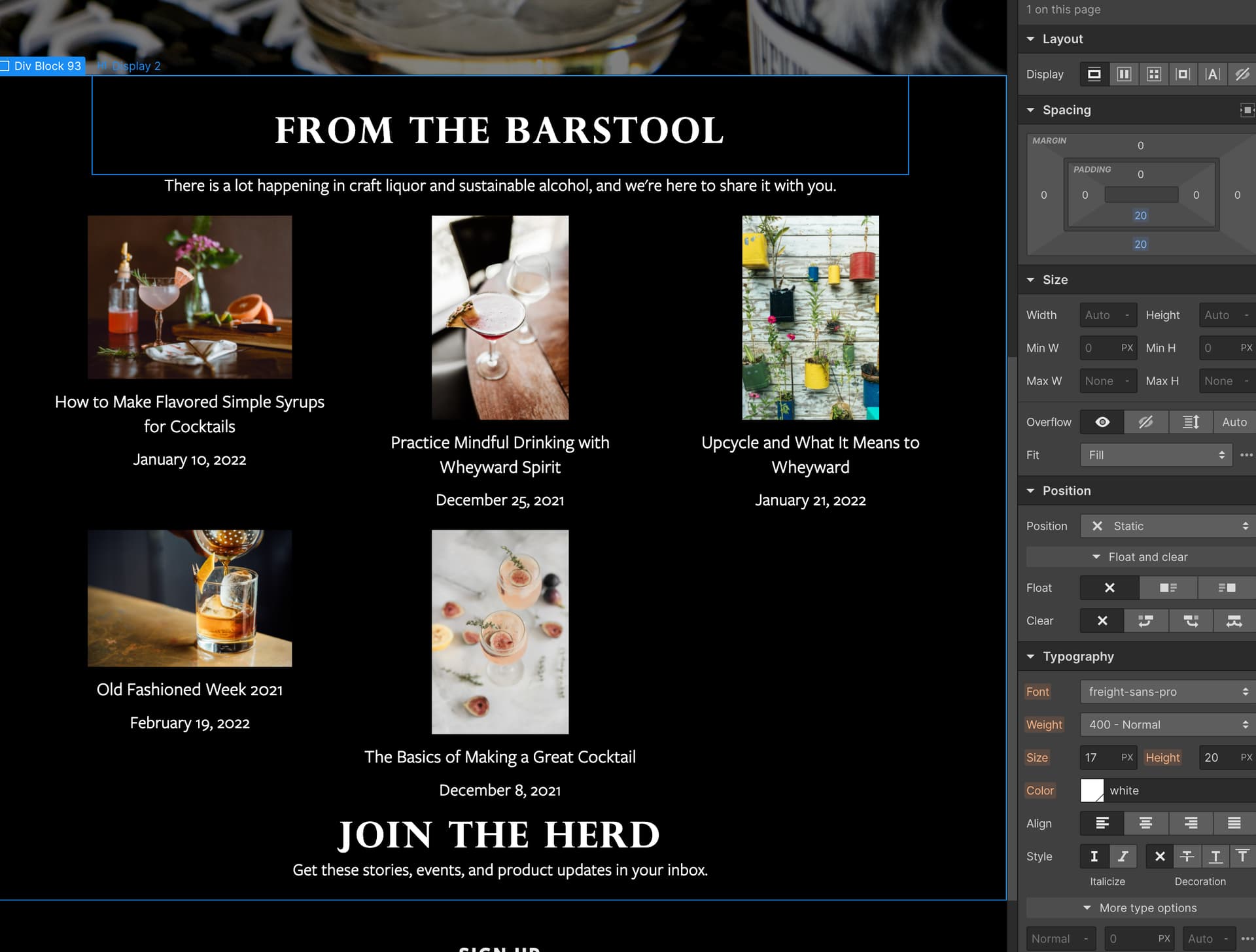
When I look at the back end of this site, the headings all look right and spaced correctly. But when I publish to the staging site, they look squished together. I’ve tried adding div blocks to act as spacers, tried to auto margin and manually create margin, I’ve tried moving elements — nothing seems to work.
Also any design advice will help. I have sample images in the site now so I’m planning to generalize those into squares. But otherwise the design is falling kind of flat.
Your Blog page is password protected so I couldn’t check it on live site (where the issue is appearing)
You can remove password protection for some time, if that is fine for you. Or you could share the password then I would be able to check it. If you don’t want to make if public, you can DM me.
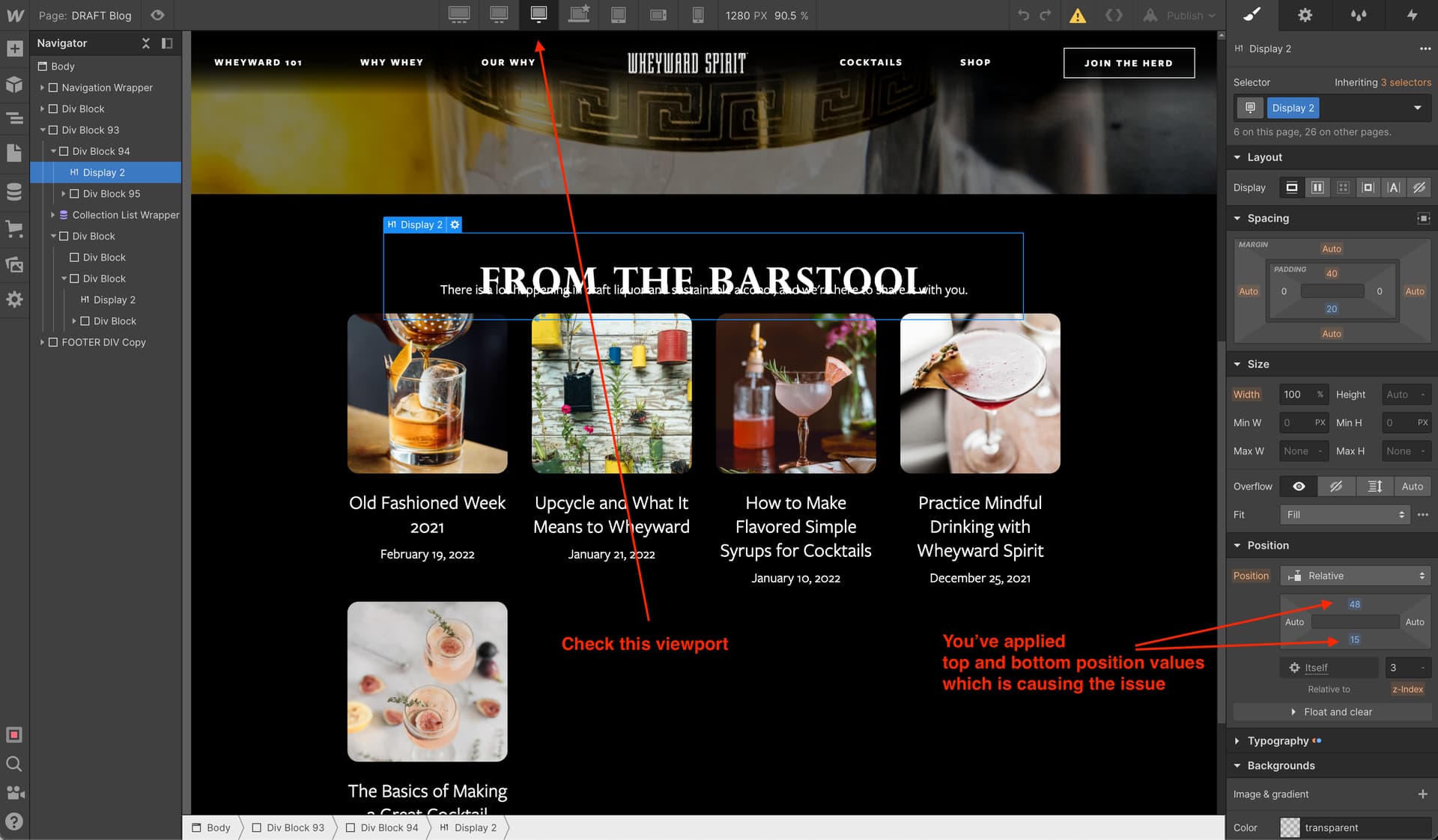
Also I see that you have applied larger margins in few places. For proper spacing I’d suggest you also make use of padding on the parent elements like sections and containers.