Hi webflow community! I’m working on a team page that features 3 collection lists for each department. Each collection list has an image and 2 headlines. The issue I’m running into is I’ve selected the 4 column layout, but once my browser scales below 1615px the columns start to create spaces.
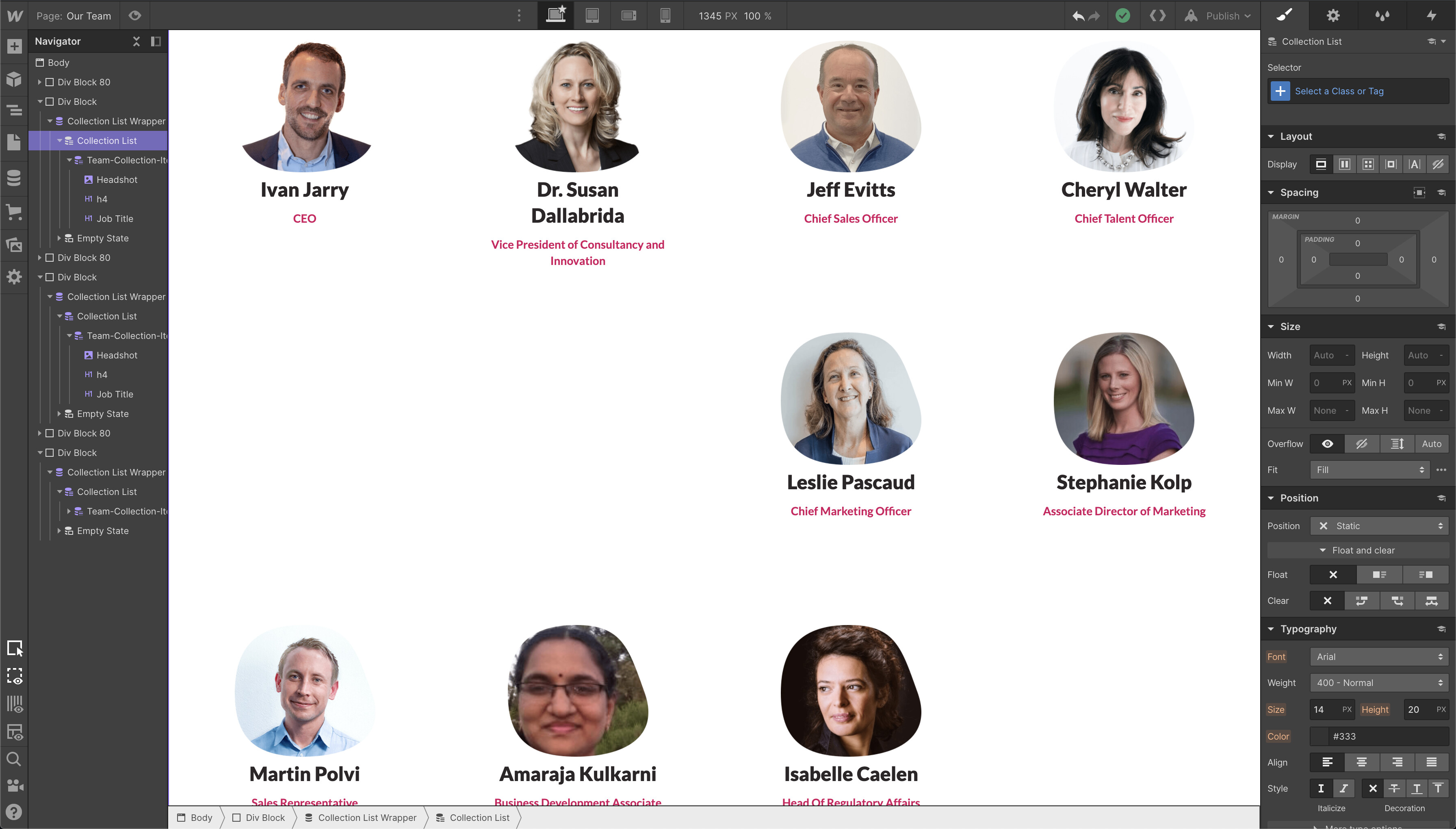
To piggy-back on what @robingranqvist mentioned, I’d also suggest you refrain from using the alternative layout options on the collection list element and instead keep it set to “Full Width” and use flexbox or grid display instead:
Just like the Column element, these options tend to work against you in some cases and are all but depreciated—not to mention flexbox/grid will give you more flexibility and control overall.
@mikeyevin When I utilize the full-width setting I am unable to drag a div or grid to prevent each element from taking up the viewport. @robingranqvist Suggestion fixed the problem for me, but if you’re recommending a solution that is the best practice I’d like to give it a try.
Not sure what you mean by dragging a div, but the items should take up less space as soon as you set the Collection List to display: flex. To mimic the four column layout you have setup now, make sure select “Wrap” on the Children setting, and also set the sizing basis to 25% for the Collection Item:
Hahah glad I could help! Obviously there are lots of different ways you can go about doing things, so if nothing else this gives you some idea of how you can tackle similar situations down the road.
A cool benefit of using flexbox is that you’re not limited to 4 static columns, so changing the the Justify setting to center will keep content on rows with 3 or fewer columns centered relative to the list as a whole: