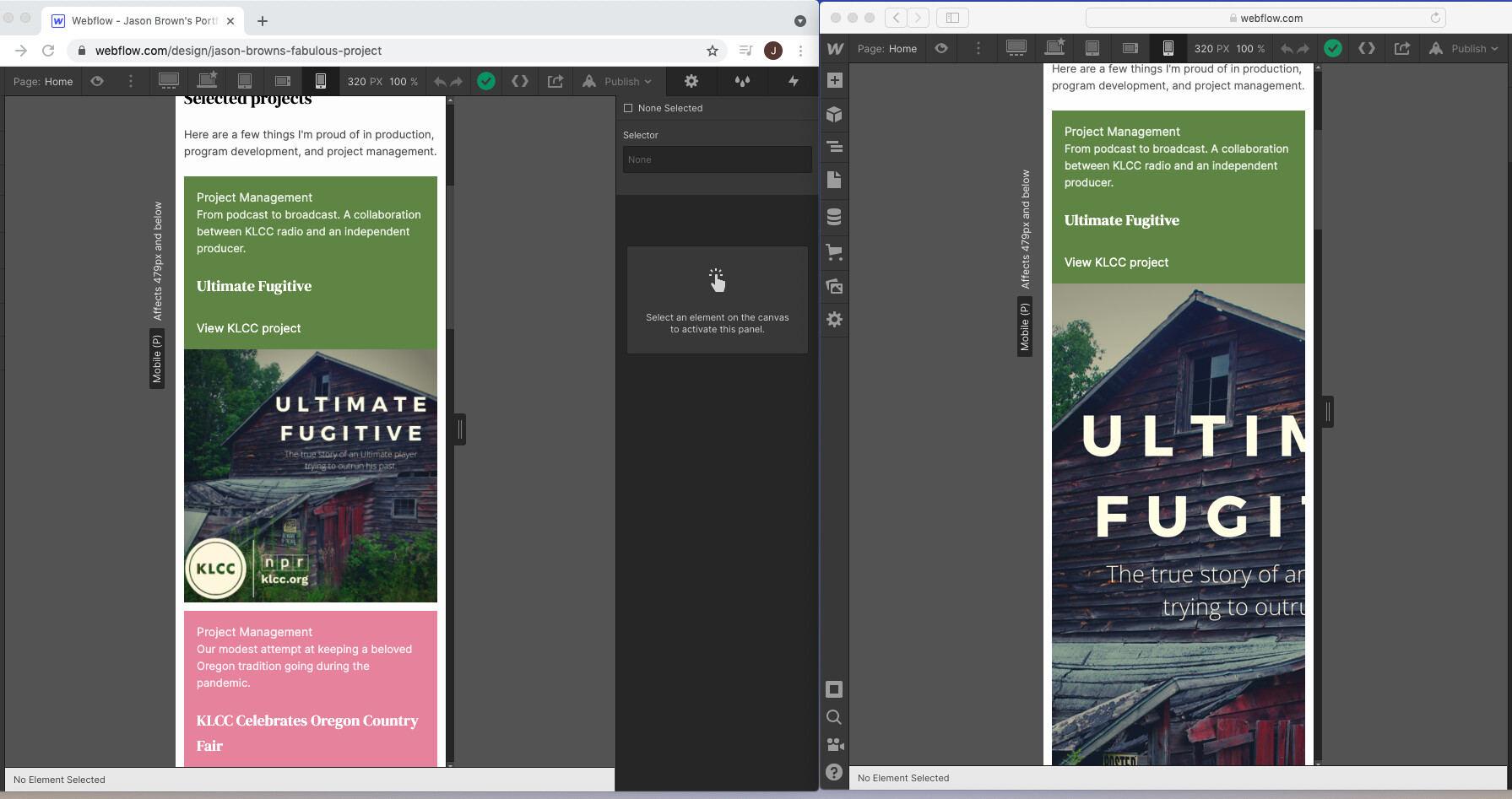
I’m working on the Portfolio project and I primarily do my work on Chrome on a MacBook. However as I was looking at my site on my iPhone I was noticing that it doesn’t look nearly as nice on that device as it does on the 320px breakpoint as I edit in Chrome. As this made me curious I popped open Safari on my laptop and it displays on those smaller widths much as it does on my iPhone.
I’ve attached a screenshot here: the left is my project on Chrome, which looks rather nice, and the right is my project on Safari, which looks less nice.
Further adding to my confusion is the fact that when I pop my site open on Chrome on my iPhone, it looks like it does on Safari on my phone, which is to say not like Chrome on the desktop pictured here.
Are there things like breakpoints, but for browsers? In other words, is it possible to design for particular browsers and for the design to respond to the browser, as well as the size?
Thanks for your time.
Jason
Here is my site Read-Only: *Webflow - Jason Brown's Portfolio
(how to share your site Read-Only link)