Website looks different on other displays

Hey all!

I noticed when I check my website on other displays the spacing of elements is different.
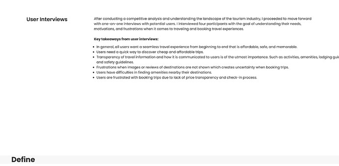
I created and published my website on my PC desktop but when I tried viewing it through my Macbook it created a gap between section much bigger than I’d like. I’m thinking it may have to do with the layout of my sections and I’m not sure how to fix this.

The first image is from my desktop and the second is from my Macbook. This difference in spacing continues on throughout the webpage.

Any help would be appreciated. Cheers!


Here is my site Read-Only: LINK

[2]:


Bump, really need some insight here.

Hi

After long time of searching the Read Only Link you attached, unfortunately, I could not find the page you attached in the screenshots :frowning:

Ah sorry the website is still in the works. But on the homepage once you see the first case study and select the button it should bring up the page I’m having difficulties on. The screenshots I provided were only a portion of the page just an example of what I’m having issues with. It runs throughout the whole page. :pensive: