Slider images on desktop are looking good, but when switched to tablet or phone they overlap

Hi everyone, I’m new to webflow have made a slider that looks good on my desktop, but when I switch to tablet or mobile, the images are overlapping:

On desktop:

Any idea why this is happening?


Here is my site Read-Only: LINK
(how to share your site Read-Only link)

Welcome to the community!

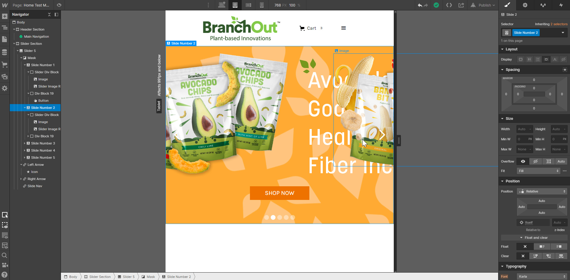
From what I can see in the screenshots it looks like your mask element (this helps the other slides stay hidden when their not selected) is probably wider than the visible page width. Since each of the slides have a product image that’s extending past the left edge, they’ll be visible on the adjacent slides.

That said, to better help out with this specific issue, please include your read-only link or the published site if available.

1 Like

Thank you! Really appreciate your help!