I have a search bar icon which opens/closes a Search window. This uses an open/close interaction to do so and it is placed within the navigation. This works perfectly on desktop, but for some reason the window won’t open on Tablet/Mobile breakpoints. Is this due to being within a hamburger interaction? Can anyone offer any ideas why this is happening?
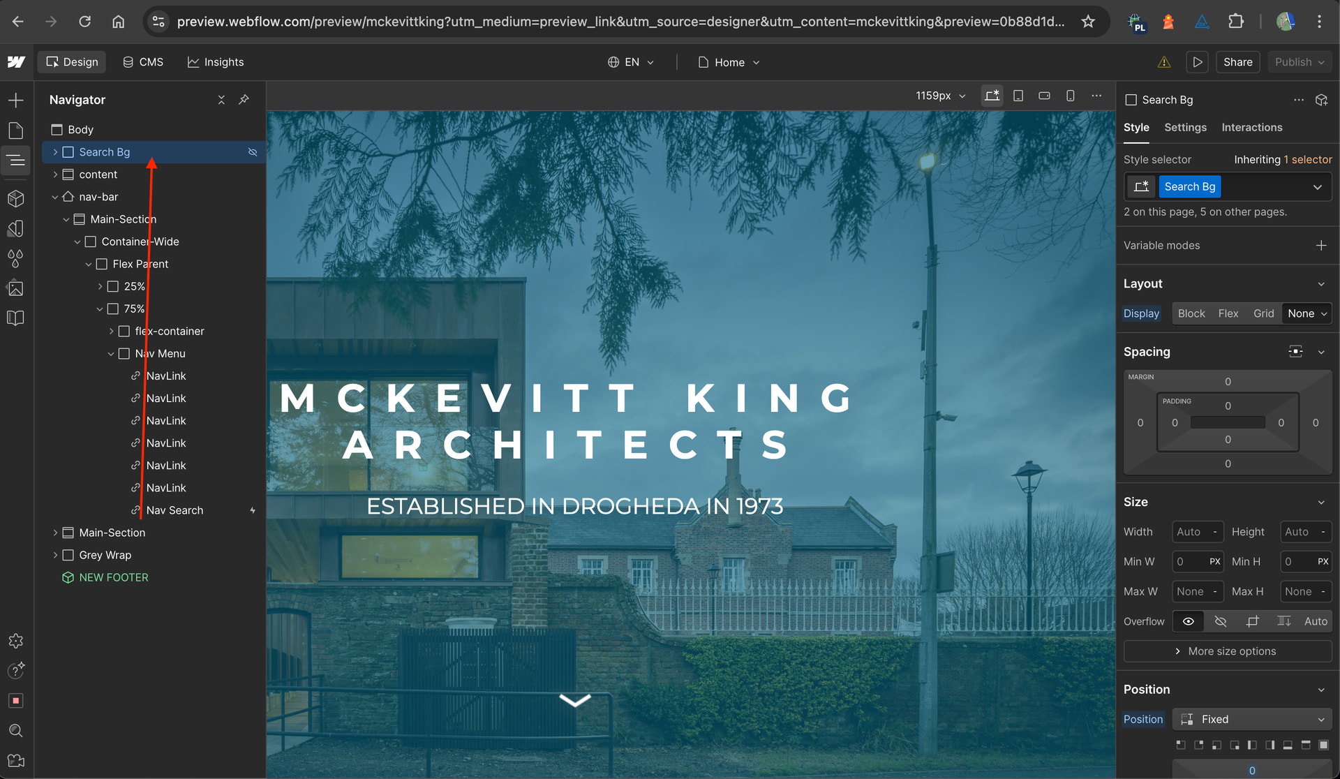
You can move the Search Bg element out of the navbar element as highlighted in the screenshot below and also edit the open search interaction to affect ‘All elements with this class’.
Hey @Bammedia , To make your search bar interaction work reliably across desktop, tablet, and mobile, you’ll want to restructure your search so it’s independent of the mobile nav’s internal mechanics. Here’s how to do it step-by-step:
2- On the Nav Search (search bar icon) button click, update the interaction settings so that it targets All Elements with this Class (the top option in the dropdown).
3- Add a custom attribute role="search" to the element. This helps screen reader users by creating a clear landmark, allowing them to navigate directly to the search section.


