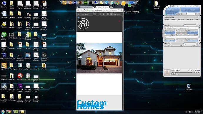
Hi, I’m currently building my first site, I just ran into a little problem, when I create a section and apply a background image I’m really looking for it to be responsive. I used contain, preset 50% - 50 % no repeat, no fixed so I tested with the toggle preview tool and shrink the page to a very little size, and the image did resize, BUT the problem is that the section stays the same size height. Check the picture, see the space on top and below the picture ? thats my section not shrinking, any ideas ?
Hi @Netmen, Great question! For background images you’ll need to change the height of the container for each breakpoint. This particular case would possibly benefit from using an actual image with your content laid on top of it (for true fluid responsiveness)
Hope this helps! ![]()
Pardon my lack of knowledge as im new to webflow, and I’m not a webdesigner, but what I have is a section with no container, if I apply a container to the section, the background image wont be displayed fully from left to right, I judt want what the website below does, this site is the great example of what im after, please see the top section HOME PICTURE, as you shrink the page the section shrinks too, and if you make it bigger it does the same. http://www.avanticustomhomes.com/
I need to keep the main picture the size of the whole screen at all times, I think this wont be possible with a container right ?
Please HELP !!! I just don’t see a way around this problem, even webflow.com does NOT have this technique on their site.
The problem you’re having with setting the image as a background-image of that section is that the section is still empty without any other content placed within it. The background-image is technically not inside the section. The section height will vary depending on the elements inside of it unless you specify an exact height per breakpoint.
To make your image and section height appear ‘fluid’ as you resize the browser, here is what you can do:
- Instead of styling your section class to include the image as a background-image, open the Widgets panel and drag an image widget into the section.
- Give the image it’s own class-name and set its width to 100%
- Do not specify a height for the image in your class style
- Upload your image into the placeholder
- Ensure that the height of your section is set to ‘auto’ as well
- Under your Navigator tab on the right, you should see the image nested inside the section
- Now the section should conform to the image (or anything else) placed inside of it
That should be all you need to do. Hope that helps. Good luck!
You nail it buddy !!! thank you very much, I did that yesterday, but I did not applied the 100% width ![]() , thank you very much for the help
, thank you very much for the help ![]()
