Is there any iPad landscape view options in webflow. I’ve read in one of the forum topics that the default desktop view looks the same as the iPad landscape view. As you can see, this isn’t the case.
The iPad landscape view looks completely different and there is no option to fix this.
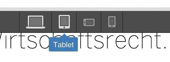
Click the tablet view icon first, and then click on the desktop view icon. Now hover over the right edge of the visual editor window with your mouse as shown in the screenshot below and when you see the edge highlighted blue. Click and drag left to 1024px
In fact I understand, if I change the size view and change something in the 1024 px view for the iPad landsape view, it has effects in the webbrowser view. But that’s the problem.
Changes you make when you view at the 1024px view only applies to the desktop settings, and so won’t affect the tablet portrait media query.
Unfortunately, what you are trying to do with the live text next to an scaling image in each box is difficult. So imo, if you want to design it like that, then you need to work on the desktop design at the smallest possible desktop size before it breaks to tablet view - which is at 992px. So you’d drag the viewer in like I showed in the desktop view to 992px, and then get the design to work at that size, and then you can add additional media queries in the custom code section to adjust how it looks on bigger screens like your laptop if you need to.
I understand your idea. I should design the whole website for desktop based on 992 px. But this is not really good. I mean if I do that the whole design looks different on my macbook pro (15 inch monitor).
To be honest, I thought webflow is a tool for designer. And there is no need to write or enter any code. I’m not a coder and I really don’t know what kind of code should I write or paste to get the things work for me.
Thanks for your support. But to be honest, at the end you are only saying "Hey that’s not working with webflow. You have to design your whole website based on 992px than you have no problems. Or enter “custom media query to your head code”.
Webflow is a little bit complicated, don’t you think? I still don’t get it why you guys are not adding custom breakpoints or just a iPad Landscape view directly in your interface program (instead of entering custom code).
This is not a good user experience for me as a designer.
On your landingpage you guys are writing “Design and launch dynamic, responsive websites.
Without writing code.” And now for the basic stuff regarding responsive design, I have to learn coding??
I don’t work for webflow. Am just a designer that uses it like you.
I think webflows goal is to be a design tool for websites where you can make sites without knowing much about code. But to be honest, you are always going to need to know a little bit about how the code works in order to fix problems that the platform can’t deal with. Grids and the media queries associated with them is one area where the current platform is limited, and something that lots of people like myself have brought up on the boards that needs to change. But, who knows how long it will be until they do.
So my advice would be to learn to code css so that you can come up with workarounds, when you run into limitations. It’s not hard to learn the basics, and there’s plenty of free videos out there.
Hey, is there any reason you can’t merge the two images in Photoshop (or something similar), then use that one image as the background for a single div, float right and set to 100% height and 50% width of the parent container? If the main issue is that there’s unwanted space underneath the bottom image, I reckon that should solve it. Maybe?