How do I prevent a pop-up modal from being hidden or stuck under my mobile fixed navigation bar?
To recreate the issue, visit the website (password: tellygramz) with your mobile device or limit the view to 478px wide.
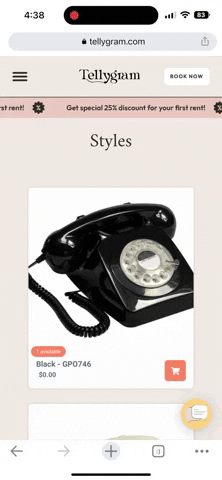
Go to the “STYLES” page. Click on a phone. You will notice the pop-up modal is caught under the fixed nav and prevents the user from performing any other action except to book.
I can see that the pop-up window is being blocked by the Nav bar.
To fix this, you’re going to want to change the Z-index of the pop-up window to be greater than the Z-index of the Nav bar. I couldn’t replicate this in the designer because, for whatever reason, the product options (telephones) were not appearing for me. However, I double-checked this solution on the web browser. You can check it out here:
I hope this gets you headed in the right direction to solving your issue!
I just thought of something. Try just setting the Z-Index of the Nav bar to 99997. This is a lower Z index than the pop up window’s current Z index of 99998. Hit publish and see if that worked for you.