This is the result http://maxsystem.webflow.io/
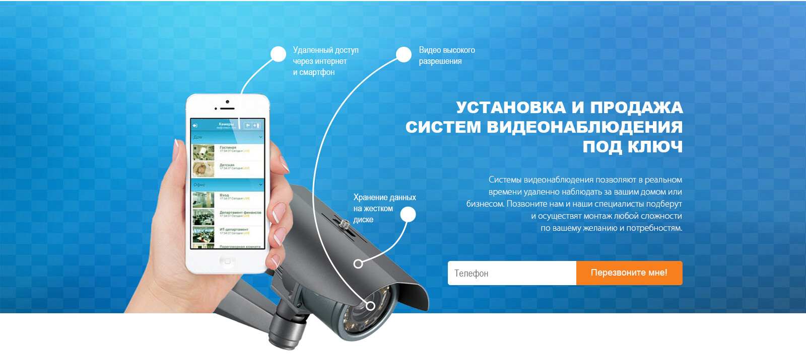
I don’t know how to put texts on this picture and the second problem is that when I make the window of brawser smaller (resposive) the picture of phone is not becoming responsive. It goes out of background.
Maybe the way I do it is completely incorrect. Than tell me please how to do it correctly. The result which I need is in picture I uploaded.
Sorry for stupid questions but there is no way to learn it another way. Tutorials are not helpful - I could’t find there the solution to my problem.
Thank you all!
Maybe someone can help me here.
Hi,
you should be able to solve this with Position Absolute in the Display Settings: you will be able to position each element ( a text, an image, a block) over your Hero image, in any position you like.
You can also decide the “levels” (like in photoshop, if you are familiar with this software) using the z-index: give a number (level) to each element to bring it below or over another element.
Webflow enables you to modify/adapt your layouts for tablet, mobile (landascape) and mobile (portrait).
So, when you are happy with your layout for desktop monitors, you must enter the Tablet view, and make your modifications in order to achieve the desired visualization.
Then you pass to Mobile (landscape) and do the same. When happy, go pass to Mobile portrait visualisation.
The great thing of Webflow is that what you change in Desktop visualisation can impact the other devices view (in cascade). But what you change in mobile visualization is not changing upward (so the other layouts will stay ok)
Look at the link I sent to you.
I know that in order to adapt to mobile you need to switch to mobile version and change it there.
The problem is that when you move the window of browser to smaller (to mobile size) the picture of phone and camera come out of background. How to make them synchronously become smaller with background?
May be it would be cool if you show me in webflow. Thank you very much!
Thank you for sharing your link. It is very clear that you are not following my previous steps: you’ve worked only on the desktop screen view.
use the icons to switch between views: you can then modify, in each views, the size of the phone, the size of the camera, the size of the text blocks, the font sizes, the button sizes…
then the “responsivenes” is achieved. tha’s the magic!
there are many tutorials in the youtube channel of webflow: I suggest you to have a look there for further details.