Hi there
So my companies site is all up and running on Webflow and now due to a load of feedback it turns out my hole site is not responsive. I have spent hours looking up videos and forums but I just cant seem anyones ideas that seems to able me to do this simplest of tasks.
For Example:
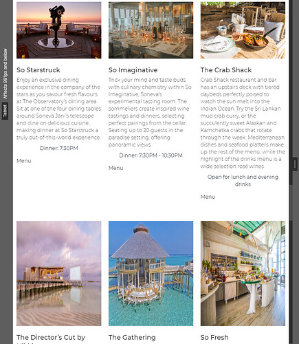
How and why are these collums not responsive. As far as i was aware adding VH and VW allowed the site to function. But when I check table mode, phone mode ect I have to design toe site for all different views. And the I go on to a laptop with less heigh and the boxes are all stretched.
What am I doing wrong?
Also here, looks great right?
Well its not great:
Thanks for help in advance.
Here is my site Read-Only: https://preview.webflow.com/preview/classicperspective?utm_medium=preview_link&utm_source=designer&utm_content=classicperspective&preview=5a626268e960effb152a53908770cb83&pageId=5e8f68d8c5ff4d2f9bdfaf5a&itemId=5e8f68d9c5ff4de4c0dfbad9&mode=preview
([how to share your site Read-Only link][2])


