Hey all—
So I’m having issues with my website’s navbar functionality.
THE ISSUES & QUESTIONS:
The issue is threefold.
First, when clicking on one of the page links in the navbar, the browser switches to the new page, but the navbar remains open. How can I make it so the navbar collapsed automatically whenever a link is clicked/pressed?
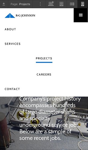
Secondly, you’ll see in the following screenshot (screenshot 1 of 2) that the menu becomes distorted after clicking on one of the links. All the links should remain aligned left, but some of them—including the clicked link—get pushed over to the right side of the screen. How can I prevent this and keep it so all links remain on the left side of the menu?
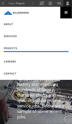
Thirdly, the second issue goes away when you close the navbar and reopen it (if you do this then they will all magically appear on the left side again). This is good, however, another problem appears. The underline now takes up the entire width of the phone screen instead of just remaining underneath the link itself (see screenshot #2 of 2). How can I prevent this from happening?
Please help with these three issues!
Thanks in advance.
And here’s a link to my current website.
Here is my site Read-Only:
https://preview.webflow.com/preview/rg-johnson-company-inc?utm_medium=preview_link&utm_source=designer&utm_content=rg-johnson-company-inc&preview=6c34483e1dedb54f66248ccbd251fea9&workflow=preview

