I’m having an issue with the mobile menu in the table and smaller screen view. I can see it in the layout of the navbar, but when I view those screens, it’s not there. I made my own dropdown menu with a “hamburger” link image, but I want to use the one Webflow automatically creates (see screen shot). Can someone please explain why I can’t see the mobile menu - or more precisely, how to get it into view, because it’s there, somewhere…
Thank you!
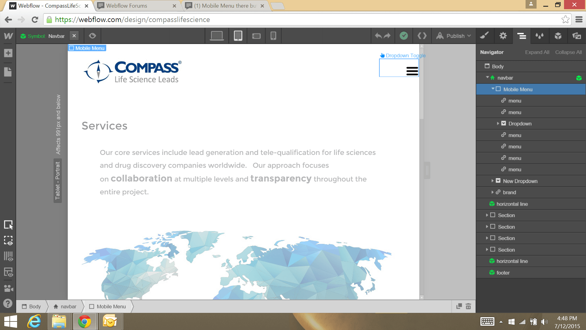
The issue is that the menu button from the default nav has been deleted. The navbar needs that menu button to work properly.
I think the easiest thing to do, is to drag a new menu button to the navbar, on the same level as the Mobile Menu class.
Then, I would delete the New Dropdown that you added to the menu, since that is not going to show on the main navbar level when the normal mobile hamburger icon is shown. You can put your dropdowns inside of the Mobile Menu div as a sibling to one of the normal links. You can also put dropdown widgets within other dropdown widgets.
One note, the dropdown widget was not really designed to be nested. It may work, but we do not recommend it, as having a lot of drop down menus on one main navbar can be hard to use for a user on mobile device.
I hope this helps. Let me know if there are any questions.