Hi Webflow Community, let me start by thanking everyone for reviewing my issue.
The main problem is the clients machine doesn’t display the site to fit the viewport properly so I can’t get the site through acceptance testing.
The client is seeing the sections on the pages much larger that I am on my MacBook Pro. I’m needing your help to optimise it for my clients laptop.
I’ve setup the different breakpoints. I think I have to optimise it with media queries but I’d like to hear your thoughts.
Here are videos and images of the issue in action: Dropbox - Sizes Monitor - Simplify your life
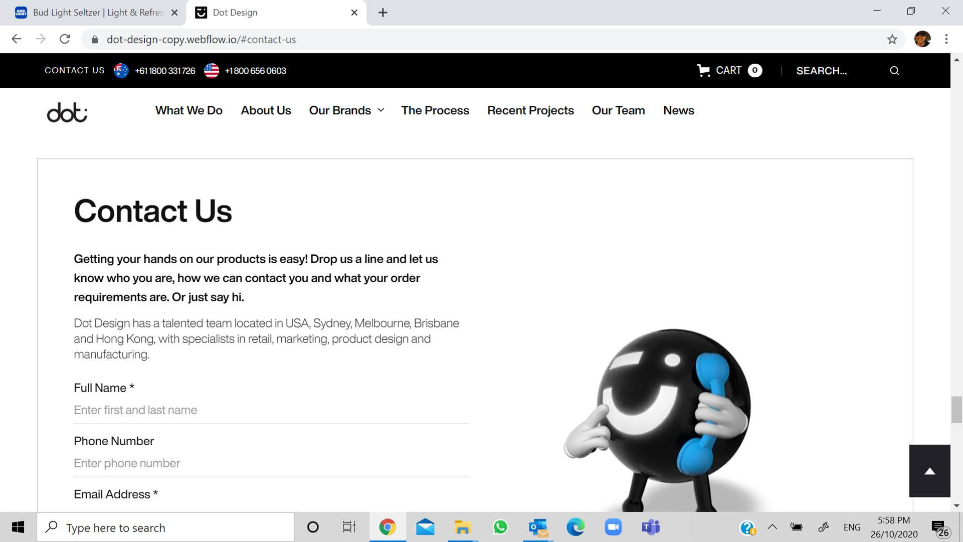
Attached is my view. MacBook Pro.

Attached is the clients views. Unnamed 1-5.


This is the view in designer.
These are the pages.
https://dot-design-copy.webflow.io/
https://dot-design-copy.webflow.io/product/quickfit
Need help with optimising this if you can help out I’d really appreciate it.
Happy to ping you some money upfront to assist sorting this out. We have heaps of projects, keen to partner with anyone that can fix this moving forward.
I also posted this in the freelancer area here.