I’m not to be over-critical..
My finger hurts.
I cut it off by accident a few days ago in a cooking disaster.
It’s reattached and healing… but it frigg’n hurts
It’s very hard to type.
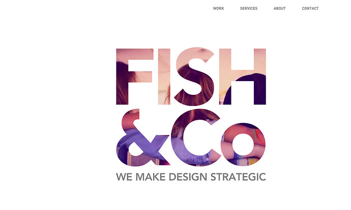
The first thing you see is a nice video…
- and it’s really nice that it collapses into the Logo “Fish & Co”.
Personally, I would consider this site
- to better suited as a Multi-Page website.
I’m sure quite a few people will disagree.
Two problems though… (as seen in this video)
http://quick.as/LZayTLDDw
- the video looks great - but after it collapse into the logo…
- it’s an array of flashing and distracting colors.
It needs to transition in a static image - or a “slower video”
- where the colors are not so overwhleming / distracting.
- the video never restarts. If you reload the site - you only see the “Fish & Co” logo…
- which I already said was distracting.
You don’t see the video collapsing into the logo.
So on 2nd load of the site… all you see is this distracting array of colors.
You have a very nice white / simple intro page that becomes distracting.
After the intro… it would (IMO) be better if the logo “was Simple”… no movement - or slow movement
like this.
This is very distracting
http://quick.as/7w10FGggb
Your Our Work section is just TOO MUCH information crammed onto the screen.
http://quick.as/j2O3UqAAo
Perhaps consider doing what you did with the Overview section.
Segment “the work stuff” into tabs or into Modal windows… or consider a multi-page design.
This is nice. Very simple. Easy to use / easy to understand.
http://quick.as/xpwasZ00A
Our Services… is a BOOK… to much information crammed onto the screen.
http://quick.as/6Y5khQ33e
Again… your use of the Tabs in the Over section would work nicely here.
Your About Us section
starts off with a ton of images… then finally gets to the meat (David & Tanya)
and finishes with even more images.
What people want to see… are David & Tanya.
It would so so much better… if when you click on the About Us option…
and see a simple screen that tells us about David & Tanya. Simple. David and Tanya.
About Us… is about David and Tanya… and then Company… (which you didn’t mention).
So the whole thing is about David and Tanya.
Not about… Not I am Plastic. Not about BandID. Not about Fish & Co Hampton.
Your Contact Us option… doesn’t have a Contact Form
- it doesn’t really need one… but why do you have to scream Contact Us ?
Can’t you just put the contact info into a Footer ?


