Landscape view on cell phone is cut off

Good afternoon Forum!
We are having difficulty with the landscape view rendering more than half of the text in the field is cut off. And there’s a huge gab between the first and second sections. Please see the attached image. We can’t see this in the landscape editor’s view. Only on the actual phone device. Please help.


Here is my site Read-Only: [LINK][1]

https://preview.webflow.com/preview/deft-ux-design?utm_medium=preview_link&utm_source=designer&utm_content=deft-ux-design&preview=dd1ea536d47b89511992ab9809c8b8d9&mode=preview

It looks like your text div block has a bunch of html breaks. So first step is to remove those.
image

Then I would recommend changing your Background Video Flex Align to Centre.
image

Also you have a background image that loads on your background video div. You should delete that.

Thank you so much for your help and speedy reply!

Dear Drew,

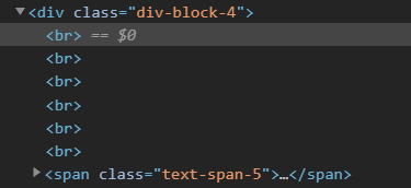
We are having difficulty finding the bunch of html breaks in the text div block, so that we can delete them. Would you kindly, explain how we can do this. Thank you.

No problem.

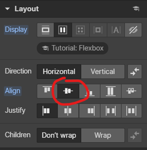
If you do the Flex change first it might be a bit easier to remove them.

Then just click to the left of your first word “Research” and click backspace a few times. It should slightly move you up as you remove the blank rows.

Drew,

Thank you again for all of your support. We changed our Background Video Flex Align to Centre in the base desktop and i think we deleted (removed) the background image. However, we continue to experience problems with finding the bunch of html breaks in the text div block, so that we can delete them. As a result, we still are having difficulty with the landscape view in a cell phone. If you look at the site on your cell phone in landscape view more than half of the text in the field is cut off and their is a huge gap between sections in landscape view (same picture in beginning of post), when inspected on landscape view in the WF editor it is harder to see. We even tried to delete the text box and add it again, to no avail.
When we inspect the code we see the extra div’s clearly. When adding the new text box to the background video, instead of adding it at the top, the editor added it at the middle automatically. Not sure what’s going on.

https://preview.webflow.com/preview/deft-ux-design?utm_medium=preview_link&utm_source=designer&utm_content=deft-ux-design&preview=dd1ea536d47b89511992ab9809c8b8d9&mode=preview

So it looks like you have some conflicting CSS that is causing you the issues.

I would start from the top and work your way back down.

Banner:
Display: block
position: static
no margins
height: 100vh
width: auto

Remove Container Banner and Container Banner Half

Background Video:
Display: Flex
align: center
width: 100%
height: auto
position relative

Replace your text block with a heading (should be an h1 for seo purposes)
Add margin as needed to get where you want

To remove that blank space below, its actually a margin top on the Container Small Grid in the section below, starts on the tablet breakpoint

Drew what do you mean by remove container banner and container banner half?

thanks.

All the other changes have been made.

Except the text block and H1

I saw two empty div blocks with those names inside your first banner section. They had some styles that may have been messing with things

So add those items Research, strategy, etc… as a h1 and use margin to get them where i want?

Should i be doing this start at base desktop breakpoint ?

<To remove that blank space below, its actually a margin top on the Container Small Grid in the section below, starts on the tablet breakpoint>

This should be done at tablet screen level on down?

small container grid has a margin on the top of 565 if i take it down it cuts off the section from cell phone view and still shows gap on landscape.