I guess this was asked once in a while before in some cases, but I want to hear some current
oppinions on this topic and maybe some suggestions how to work “mobile first” in Webflow
while its workflow is cascading down from big screen sizes to smaller screen sizes.
If theres an already excisting way/method to do this, the let me know too please
If this is a feature that you’d like to see implemented in Webflow, the please vote for it. The popularity of features on the wishlists greatly helps the staff prioritize updates and features. https://wishlist.webflow.com/ideas/WEBFLOW-I-105
In the mean time, here is a nice workflow.
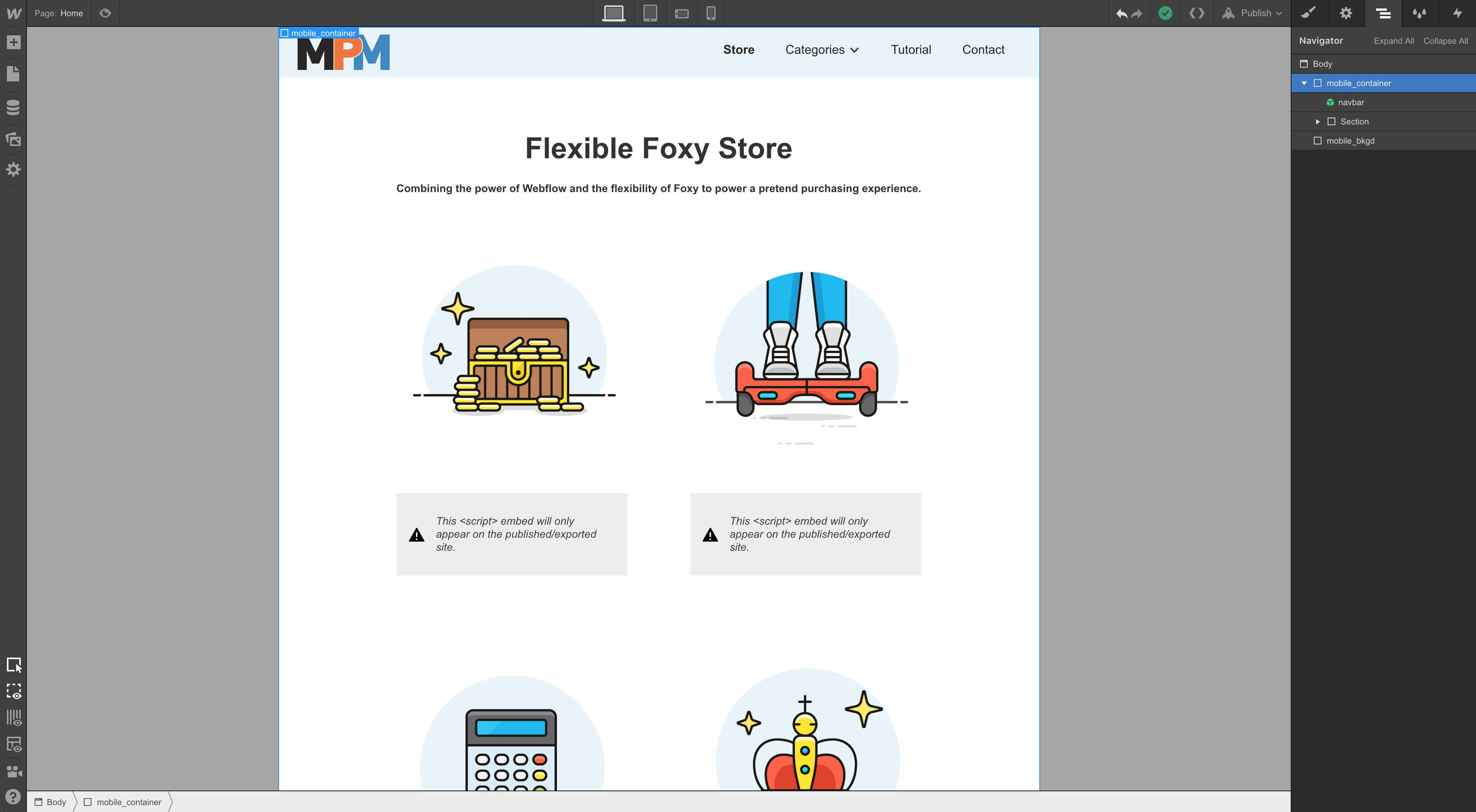
Inside the body add 2 divs
Give the first div a class of mobile_container with the following properties max-width: 479px; margin-left: auto; margin-right: auto; background-color: white;
Give the second div a class of mobile_bkgd with the following properties: position: fixed; z-index: -1px; background-color: #A6A6A6
This will simulate the mobile portrait breakpoint.
To simulate mobile landscape breakpoint then adjust the mobile_container to have a max-width: 767px.
To simulate tablet breakpoint then adjust the mobile_container to have a max-width: 991px.
To simulate desktop breakpoint then adjust the mobile_container to have a max-width: auto.
As you build the site keep all of your elements inside of the container. When you’re ready to publish the final site simply move all elements out of the container and directly under the body and delete the container and background elements.
A simple setting like: “Use mobile first pattern” would be enough allowing then to create the page by the mobile first pattern. In the backend, instead of writing media queries by max-width, it should use min-widths for the bigger sizes. The viewport icons on the top would be rearranged, from small to big. Thats all it needs and it would help a lot for webdesigners/developers/designers who are used to design from the small to the top.
That’s a neat approach but the purpose of ‘mobile-first’ is creating styles for smartphones intended as default and secondly creating multi-column styles that apply ONLY to larger screens.
After taking out elements of mobile_container the mobile styles won’t stick as default if you’ll create different styles for desktop (for example multi-column styles), as these will take priority as this is just how Webflow is configured.
Or am I missing something?
In general I find that subtracting complexity is a way messier process than adding complexity and that’s why mobile-first is universally the preferred approach.
It’s a shame that Webflow is engineered the other way around.
Coming back to this after becoming more experienced with Webflow, I can say that how responsiveness is dealt with by Webflow is not unwieldy at all.
On the contrary it’s quite clever.
It’s just a matter of familiarising with how styles cascade down from desktop to mobile portrait.
Now I feel no need whatsoever to bring the mobile-first mindset into Webflow.