As you know I’m a big fan of Webflow. But there’s one thing missing from my perspective: the possibility to turn the design process around.
Now we design from Desktop, to Tablet, To phone landscape and portrait. In other words: from left to right like this:
With most of my clients, I approach the construction of the website in a different way:
First I focus on the story that’s going to be told on their website;
Then we determine the functionality on the website;
We form and create (demo)content that fits with the story [step 1] and prioritize this;
We create a style guide (colors, font face, logo etc.);
Then I make a first design, starting with mobile first, as I already know what the most important content is. So I try to cram only the essentials in the small screen.
Then I scale up to desktop and add pictures, interactions and what else to make it appropriate. Such as extra text, sliders and all the other nice things WF has to offer.
I’ve tried this approach on WF some time, but in the end, it’s a pain making it Mobile first. I end up making a Desktop version first and “scale down”.
Ideally, I’d be able to reverse the dependencies in the design-process by adding a simple [MF, for Mobile First] button next to the portrait phone, that puts the mobile design first.
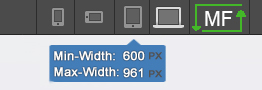
Technically, I could see the media queries being fluids as well. And then you’d have a button to specifiy your own widths, such as this:
As soon as you hit the MF-button, you get this:
It looks crappy, but you’ll get the idea right? Well, in my opinion, this is a must have for the future. Can the WF team shed some light on if that’s on a roadmap since it was mentioned by @Matt_glast year? Here’s some more info about the great possibilities of the Media Queries of Mobile First design.
I’d be happy to give feedback, beta-test or what else. Thanks in advance!
Diu, you read minds!
I was thinking about writing about the same thing when I stumbled upon your post.
But I’m more radical - I don’t want this feature unless I have an option to turn it on or off myself.
This is big mistake, really… And I’m not new to WWW (the Wonderful World of Webflow))
Meaning - my client doesn’t want to pay for multiple versions of the site and he wants only desktop version, visible identically on on all devices.
Now the Question is: why can’t I decide myself and just turn off portable/mobile option before I start designing or in the midst of it or even when I’ve finished to export completed website in the form I can easily deal with further on to integrate my design into Yii2 frameworks DB…
Now just imagine how much “loose” HTML, CSS and JS code I have to strip off before I send it to my programmer… Webflow generates tons of “beautifully arranged” but in my case worthless code…
So I ask, maybe Webflow should become a more serious in terms of “under the hood development” for developers, or at least give us such option? )
In most cases the easiest solution doesn’t prove to be the best - ability to have an option does make a huge difference…
Come on Webflow, time to grow up and get Serious! ))
Thanks for your response. Maybe @danro or anybody else from WF can give some feedback on this option?
Would love to hear if there is some (behind the screens) progress or development that’s going to be released.
I would very much welcome mobile first too.
Add to my list of must-haves rather than nice-to-haves…
Good idea Diu for the fluid setting of the media queries, ever since using Webflow for the first time I felt the fixed Media Queries inhibited creativity and freedom for maximising screen sizes.
I agree 100%. I do a lot of ecommerce and ecommerce consulting. Normally with a large ecommerce site, there is a lot of extra stuff on pages about the product, details, cross selling, backstories, coupons, reviews, related products, wish lists, scripts etc… Why would I want to design desktop first and push all of that stuff to a mobile device? It defeats the purpose. To be effective, the mobile site should be lean and not overbearing with all of the side crap being pushed to it. By starting with mobile first, I force the the client to re-evaluate the entire job. I addition, scaling up to the larger devices points the growing data funnel towards the proper receptacle, the pc. Ability to choose larger screen sizes would be a nice option, but id prefer to design to breakpoints as opposed to device sizes. They change faster then web design does.

