Hello! Can anyone in the community help perhaps? I have an issue I can’t figure out
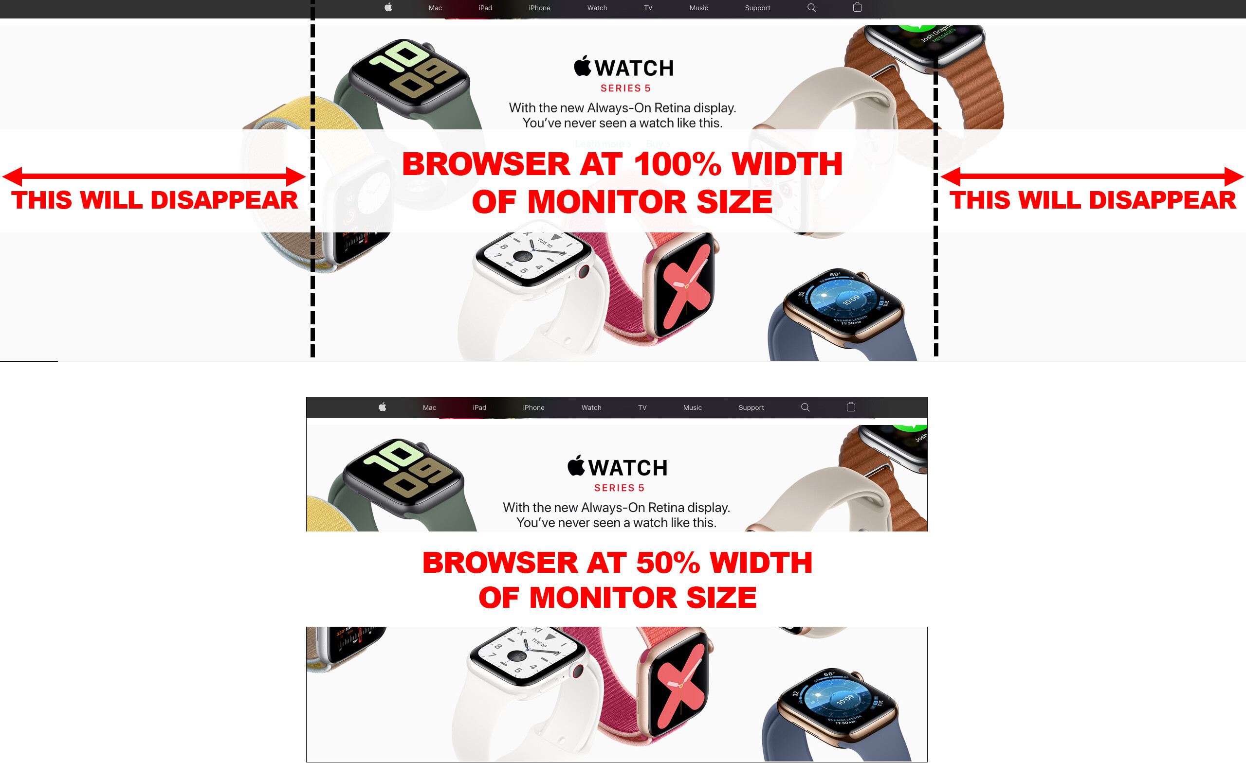
What I’m trying to achieve is what you see on Apple’s home page, where the image of the Apple watch pretty much spans 100% of my monitor when my browser is at 100% (with some white space on either side of the watch image). When I resize my browser to about 50% of its original width, the Apple watch image doesn’t resize, but the outer parts of it disappear from view outside of the column/div block/… it is placed in. (The same goes for most of the images on Apple’s homepage: when you decrease the browser in width, the outer parts of the images disappear from view, but the images stay nicely centred in whatever elements contains the images.)
I’ve added a screenshot of what I’m talking about, I hope it’s readable and makes sense. (I also pasted these images in my home page which you can check out via the read-only link below.)
Does anyone know how to do this? Any help is appreciated!
Here is my site Read-Only: https://preview.webflow.com/preview/dawson-lab-website?utm_medium=preview_link&utm_source=designer&utm_content=dawson-lab-website&preview=d05784708a444d52e6509ddbd8059329&mode=preview