Help with section on tablet layout

Hi Guys,

Building my first site for a client and I am having trouble with the mobile responsiveness on tablet. Within the services area on the homepage the section just goes off screen. I want to condense the content like it does on mobile landscape. Below is the link and hopefully you guys can help.


Here is my site Read-Only: LINK

Sorry if this is a skewed opinion (I have a real dislike of Grids and Containers!!) - any reason you’re going with Grid rather than flexbox? Again, sorry if this is a presumptious comment, I know some people like Grids/Containers!

I believe that your problem is because you are using an absolute width of 300px for your element service content text. So at the moment, in tablet view, you are telling service content text to be 300px wide no matter what. If you change this to a max width of 300px, your content flexes correctly (or indeed, set your absolute width to Auto.

Here’s how it looks in tablet view using a fixed width of Auto:

And just to really irritate you (possibly!), here’s how it looks using flexible divs instead of grid/container:

Tablet view 991px width viewport:

Tablet view 768px width viewport:

Here’s the div structure I used for that:
image

However if you prefer Grid/Container, the original solution above works :slight_smile:

I hope this helps you

Hi Andy,

This is my first project and have been experimenting with different ways of displaying the content. I posted on here to get opinion of others and understand what would be best.

Really appreciate you quick reply and feedback, I am going to test the flex box option and understand how that works. I have used grids and containers on the other pages and don’t think my experience would be able too alter them currently.

Would be able to explain why your preference is flexbox over grid?

Thank you for your help.

Chris

1 Like

Hey no problem Chris, if you do stick with it then the solution in first couple of lines should work for you - it’s essentially because you’re telling 3 elements to all remain at 300px each (900px total plus margin either side etc) - therefore when your viewport width is less than that combined amount, it will overflow.

Personally I just find I have a lot more freedom using Flexbox. I find it a lot easier to make content responsive rather than fiddling with grid frame widths etc. For me, Grid certainly has its applications but I find them few and far between. I do however acknowledge that this could simply point to a personal weakness in me as a designer, however I’ve honestly not come across a design situation that has forced me to use Grid instead of Flexbox.

That totally makes sense Andy, I have currently gone with using the grids as this is across the site, but I am going to experiment with flex box and see how this helps the workflow and implementation of any projects.

I have made the change and worked thank you. In terms of the site do you have any constructive feedback as this is the first client we designed for using Webflow and any feedback will help going forward.

You’re very welcome, I’m glad it helped :slight_smile:

I’d be happy to. Please bear in mind that I can only give my personal opinion - I’m certainly not well experienced compared to many on this forum (I’ve only been using Webflow for approx 1 year with no previous design experience). So wherever I say “I would”, please treat that subjectively as “Personally, this looks more appealing to me”!

---------------------------------------

I’d make these “cards” centred. Currently they look like this:

I would make them look like this:

---------------------------------------

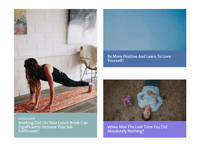
Perhaps some nice hover effects when you mouse over these blog posts? Either a slight “grow”, or a coloured overlay appearing stating “Read Article”? Here’s a great resource: Getting started with image hover effects | Webflow Blog

---------------------------------------

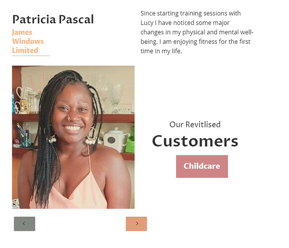
There’s something about this section that looks… odd… it all just seems jumbled together. Can you find a nicer way of designing it? How about looking into using the Slider element?

Same with this section on the About page, which I’m guessing you’ve used the same layout as your reviews? It just looks weird to me.

---------------------------------------

I would centre these “cards”, similar to the first example. To achieve this, the content of each card would need to be in their own div, flexed vertically with the content centred.

Like so:

---------------------------------------

I like the sticky navbar, however I noticed that it overflows my screen above approx 2220px width (I use a 3440x1440 monitor):

---------------------------------------

There’s so much in this site that I absolutely love! I think it’s got a great colour scheme, and I really like the subtle interactions that you’ve got running throughout. I really like the blog design you’re using as well.

I sincerely hope none of the above comes off as too critical - they’re just my observations as I navigate through your site. Don’t forget - I am nobody of great importance or experience on these forums! I think your client is going to be extremely please once you’re ready to launch! :slight_smile:

Hi Andy,

Thank you for taking the time to look at the site and give your opinion, I think that the information is very helpful and not critical. I think design is always about learning, so this is really appreciated.

I am trying to think what interaction would be best suited to theses cards, I like the idea of the cards lifting when hovered over but not sure how to achieve this as using a drop shadow doesn’t work.

The layout of the testimonial and reviews has been a bit difficult. I tried using grids and some relative positioning but doesn’t appear to have worked very well. Also I had trouble position the pagination which I am unsure how to resolve. Maybe I need to start from the drawing board with this one.

Also any pointers on getting the Nav showing correctly on a larger screen? I feel at the moment I am still getting to grips with Webflow but this tool is amazing and I won’t go back to using anything else unless some of the limitations restrict me.

Thanks again for your input, really appreicated.

You’re welcome :slight_smile:

So a couple of options spring to mind if you want the cards to “jump” off the screen. You don’t even necessarily have to use Interactions.

Here’s a share link to one of my live sites: https://preview.webflow.com/preview/ldaa?utm_medium=preview_link&utm_source=designer&utm_content=ldaa&preview=fdd10ffa7c8548fab3bfabc29b8dcd7e&pageId=5e2703716f517b60e8abbd00&mode=preview

Navigate to the Gallery page, and locate the element Lightbox Link. Click on it, and scroll down the settings on the right hand side to the very bottom. You’ll see that I have applied a Transform to it on the following States (available at the top of the settings panel): None and Hover.

What I have done is told the element, when nothing else is happening, to be at 95% width and 95% height. If you select the Hover state, you will note that the Transform for that element becomes hidden (so it goes to 100% width and height) with a 200ms transition period.

Ensure that the element State None is selected, enter preview mode, and mouse over the gallery images. You’ll see them shrink and grow. You could also apply a box shadow etc.

If you don’t want cards to simply shrink and grow, you can use Transform for a number of other things. You could set a Hover Transform that lifts the element (card) up by 5 pixels, and applies a shadow along the bottom, for example, to give it a sense of depth.

On the website above, also take a look at navbar settings as well and see if they help.

------------------------------------------------

Of course you’ve also got the option of applying Interactions on them as well as you prefer. As a further example, you’re welcome to have a look at my personal site - go to the Portfolio page, hide the element OVERLAY_HIDE, and take a look at the element ThumbTextWrap. You’ll see that I’ve applied a mouse hover “appear” animation inviting the user to click that link.
https://preview.webflow.com/preview/jolly-good-web?utm_medium=preview_link&utm_source=designer&utm_content=jolly-good-web&preview=8c64f260781dc19b0c7fde3cfe02eb8a&pageId=5d5ae115b1398c143d44225e&mode=preview

Have a play around :slight_smile:

Hi @Andy_Vaughan Again,

I have implemented some of the ideas you said,

I still can’t get the Nav to cover 2220px screen and also for the life of me I can’t seem to fix the footer with the privacy policy and t&c on mobile. It appears that its left aligned.

Any ideas how I can resolve this.

Thanks again Chris

Hello mate,

Sorry for the late response. I can’t appear to access your read-only link any more

Hi Andy,

No worries, I have launched the site, can I still give you a read only link?

Chris

Of course :slight_smile:

Hi Andy,

This should work,

https://preview.webflow.com/preview/mindful-fitness-london?utm_medium=preview_link&utm_source=dashboard&utm_content=mindful-fitness-london&preview=526a220f3e303fcf7a2043662fed19ce&mode=preview