So I have this problem with the styling of my dropdown menu’s in my nav bar. This is my situation:
I have a nav bar with 5 items, 2 of which have a dropdown menu: ‘Health News’ and ‘About’. In the full screen version everything works as I want. However for the mobile menu, I want to have the dropdown menu’s appear to the right of the main menu, in order not to mess up the layout of the main menu.
Below is a screenshot of how the Health News dropdown looks in the designer view of Webflow. This is indeed what I envision.

However in the preview mode of Webflow, I don’t have any menu at all (not even the main menu appears)

When I look at the website as published, this is the effect that I get:

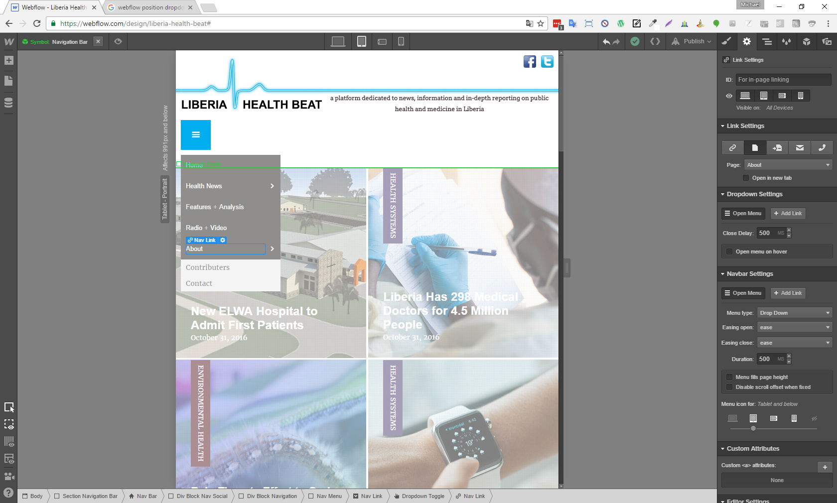
The About dropdown does not even let me change its position in designer mode, no matter what I do (auto, relative, absolute, fixed, changing position values):
I have been working on this now all day, and getting frustrated  I hope someone can help me figure this out.
@Waldo
Here is my public share link: Webflow - Liberia Health Beat
Here is the published site: http://liberia-health-beat.webflow.io/

