Alternating layouts layouts on cms collection lists

If seen some other posts about this but I haven’t been able to get it to work.

I’m trying to reverse the layout on every other item in a CMS collection list.

I’ve entered

<style>
    .w-dyn-item:nth-child(even) .service-detail-row {
          flex-direction: row-reverse; 
      }
</style>

into the but it’s coming up as invalid and not showing up. What am I missing? Is there a better way to do this?


https://virtue-media-digital.webflow.io/services/inbound-marketing

https://preview.webflow.com/preview/virtue-media-digital?utm_source=virtue-media-digital&preview=871f1221b4246ab8ae673932b2302c16

Hello @dadmacho

I made a small video for you to explain why this is happening:

http://cloud.ipagroup.co/3f50d6

Hope this helps.

@aaronocampo So the css lives in the Collection List Wrapper and selects my row directly.
Thank you so much!

If you use Flexbox to create the grid, you can alternate every other column by using the following css property:

.container:nth-of-type(even) {
  -webkit-flex-direction: row-reverse;
  flex-direction: row-reverse;  
}

Hello Guys,

I am having the same problem David was having.

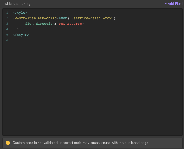
I have a CMS alternating layout for my blog collection page. I want to to display as follows:
Text > Image
Image > Text
Text > Image
Image > Text
(see attached)

But I can not get the custom code David mentioned or the one Ethan mentioned to work.

Here is a the link to the page I am working on - Our Portfolio of Exhibition Work

Please can somebody help?

Thanks,
Gabriel

Screenshot 2020-08-28 at 09.10.15|690x408

Hi! I’m not able to access this link. Can someone please reshare?

Hey @Mah_Spirit here is the link:

If any one needs to reference this again. The code format needed for this alternating collection list style effect is:

.collection-item:nth-child(even) { flex-direction: row-reverse; }

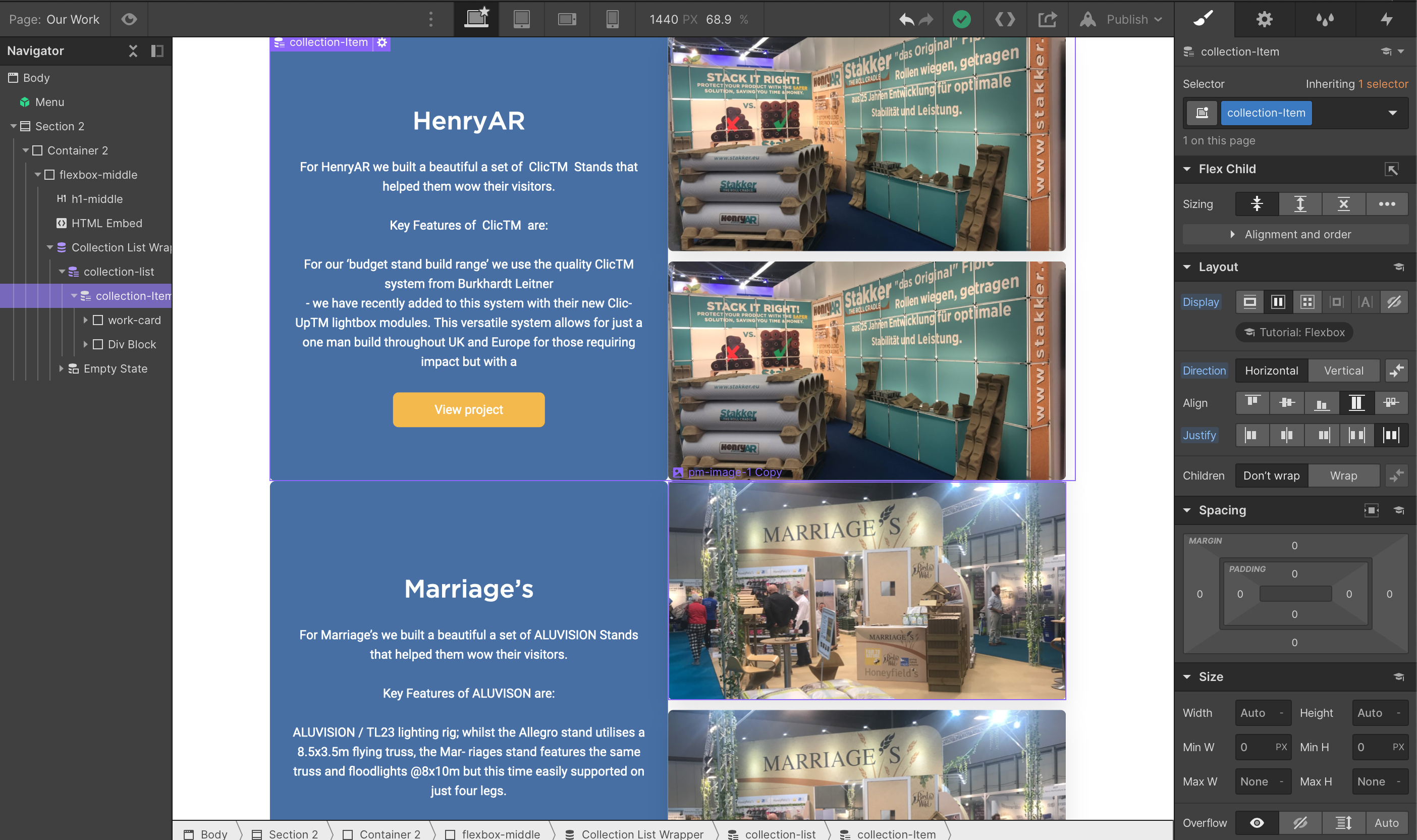
Hey guys, I’ve been working on this myself the last few days with help of a front-end developer friend. This won’t work properly on all breakpoints. In my project it removes the image in the collection list.

A little context: I use this layout for a portfolio “projects overview” page.

What fixed it for us is:

.w-dyn-item:nth-child(even) .project-details-test{ flex-direction: row-reverse; } @media screen and (max-width: 767px){ .w-dyn-item:nth-child(even) .project-details-test { flex-direction: column; } }

This fix isnt entirely foolproof, because it doesn’t properly apply margins at the right side of the even-numbered collection list items. I didn’t add right-margin for the collection item. Because it’s not necessary for left-aligned items (I have an image at the left and project details/text at the right). Also, I don’t want to add unnecessary margins to all items, you know. Going to work on that a little more!

Arron can you put again the video? Thank you it seems that the link it’s not working.