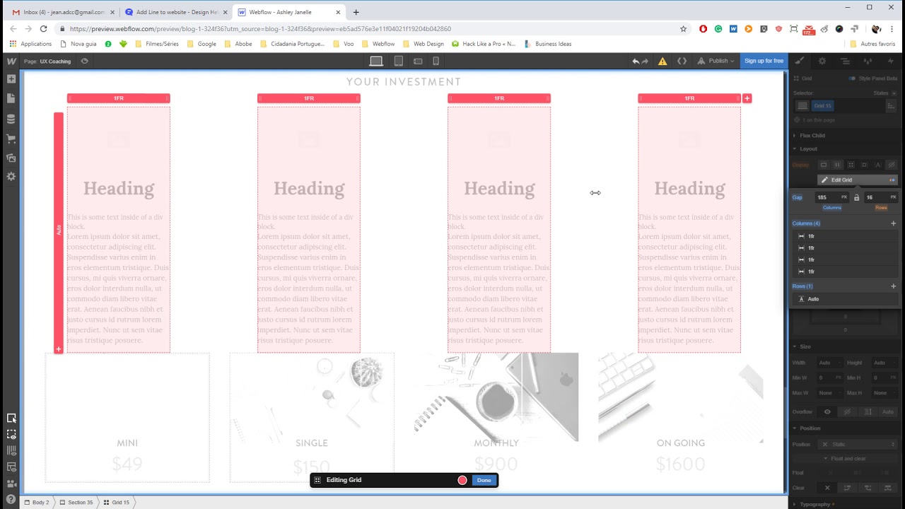
Here is my site Read-Only: LINK
(how to share your site Read-Only link)
Hey @Ashley_Janelle
If you have three columns you can set borders. In the example you’re showing the middle column has a border left and right.
Piter ![]()
Another option, not so practical as having borders for your elements, you can create divs giving them specific settings. In that case it would be something like W=2px H=100%…
Mine is set up a bit differently… can you advise with the link to my site here?
https://preview.webflow.com/preview/blog-1-324f36?utm_source=blog-1-324f36&preview=eb5ad576e3e11f04021f19204b042860
We need to know where you want to apply such changes. It’s hard for us to guess. If you could be more specific, we would appreciate it! Thanks
She @Ashley_Janelle is probably talking about the UX coaching page?
yes, it’s the UX Coaching page.
The way that things are currently structured in the grid is a mess (No offense ok? I just think that the structure of your website needs to be optimized).
Here’s a video of me trying to understand your website and ending up deciding that it would be better to rebuild things from scratch. Rebuilding starts at 03:48
The video will take some time to be uploaded, but it will get there.
Here’s a screenshot of the final result. The lines didn’t end up totally centralized because I wasn’t paying attention to that, I just wanted to get it done quickly so you could see.
I’d be willing to work with you, optimizing your website and building the rest of it. Get in touch with me and we’ll work together.


