Zoom out of proportion on mobile phone - HELP!

My site is acting extremely weird!

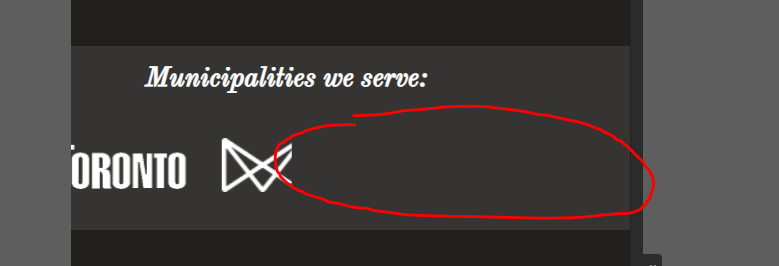
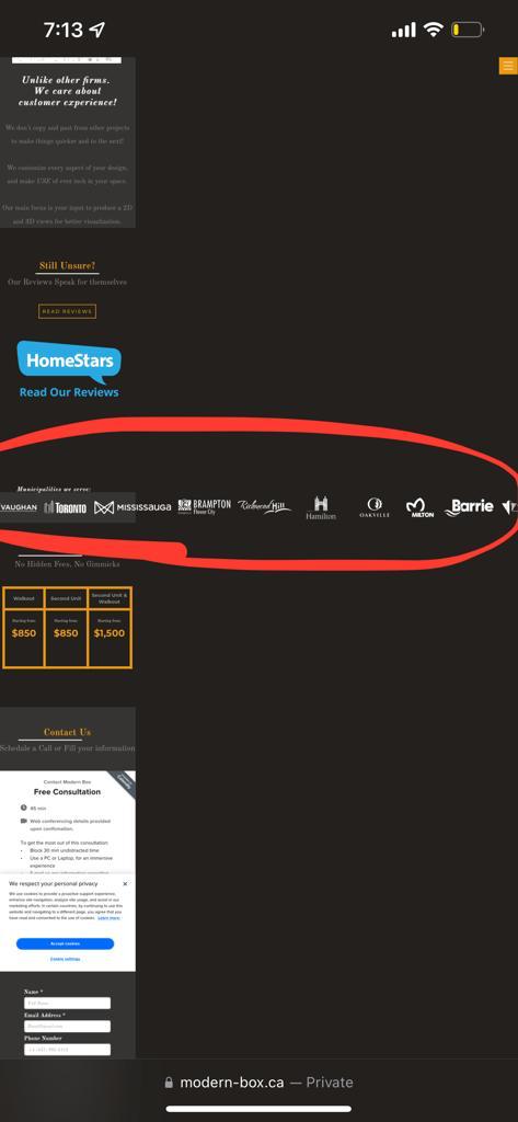
I created an endless loop in a small section showing the cities logo we work with,
And it works fine on all devices including the phone breakpoint on the desktop.

However, if you open the site from your mobile app you can zoom out too much to the level where you can see the entire loop! including the whole page.
I would like to crop it only to the proportion of the screen. And prevent it from zooming out.

I tried deleting the loop, apparently the problem still happening :frowning_face:

Any clue?
Any tips are much appreciated.


Here is my site Read-Only: LINK

2 things going on.

First, change the second .Endless-loop-1 class so it has a different class name and set the overflow to hidden on the top one.
Screenshot 2022-04-25 at 13.42.16

Your loop is now fixed but you have a second problem.
In the section above the loop (Section - LP), there’s a link block with a 1130px left-margin, delete or change this to 0.

1 Like

Great, thank you @Franne_Norman so much for your help,

However, once I set the overflow to hidden it cuts off like this:

Any idea?

I explained it wrong, set the overflow to hidden on the top one, not on the wrapper. Sorry about that. Let me know if you got it!

Works perfectly amazing, Thank you @Franne_Norman, you are a true legend.
You have no idea how much I was struggling on this.

Thanks again and wish the best for you!

1 Like