Hi commu,
I made a similar post recently but I still struggle with some width issue on my website.
The tricky part is that everything works right on preview mode so all the Xray mode and Read only link are useless.
The issue happens on mobile live version.
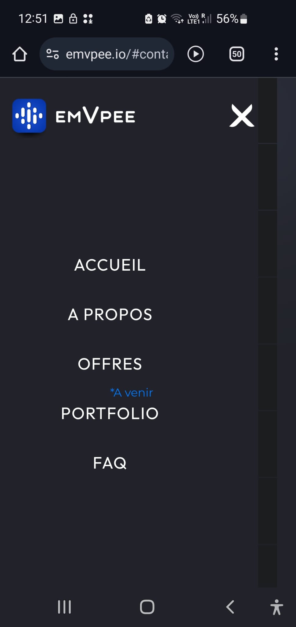
So when the website is loaded, everything is fine. But when you click the menu hamburger the issue occurs. First, there is a gap on real version that is not happening in design & preview :
And once you clicked on the menu hamburger, the whole website gets unstable with horizontal scrolling and background problems.
I’ve been scratching my head on it for quite a few days now, I hope some of you guys can help to resolve the problem.
All the best,
Clem
Here is my site Read-Only: Webflow - EmVpee
Hi Clem,
The horizontal scrolling issue with your mobile hamburger menu is typically caused by elements expanding beyond their container during the menu animation. Here’s how to resolve this:
First, add overflow-x: hidden to your body tag when the menu is active. You can do this through your hamburger menu interaction by adding a class to the body element.
For a more comprehensive fix:
- Check your menu container’s width settings - ensure it’s set to 100% or a fixed width that doesn’t exceed the viewport
- Review your menu items and ensure they have proper padding and margin settings that work within mobile constraints
- If using transforms in your menu animation, verify they don’t push content beyond the viewport width
- Add position: fixed to your menu container when it’s active to prevent page scrolling
If the issue persists after implementing these fixes, inspect your page in Developer Tools while the menu is open to identify any elements that might be creating additional width.
Hopefully this helps! If you still need assistance, please reply here so somebody from the community can help.