Hi,
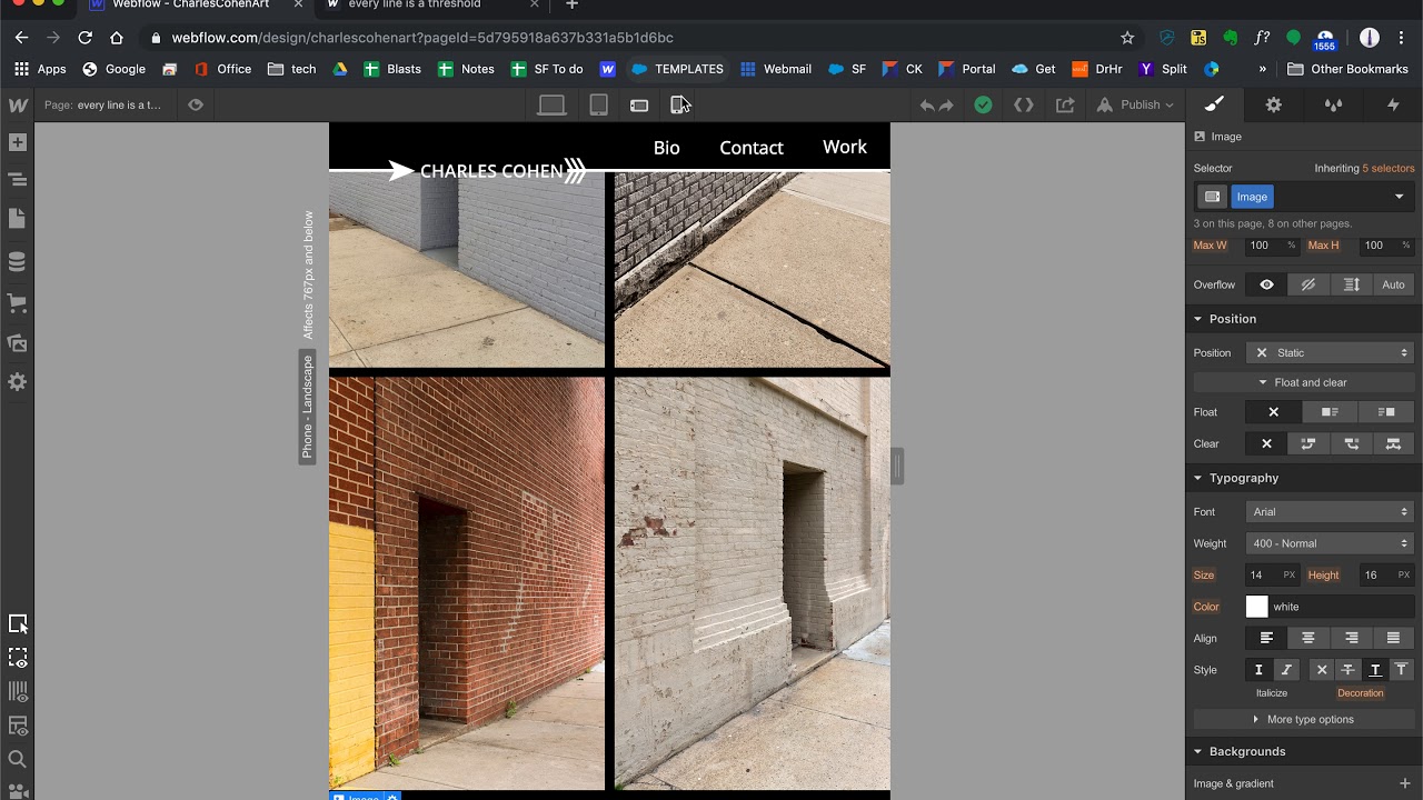
I’m building my photography portfolio site and to make it scalable I’d like to use grids with auto generating rows and columns in order to be able to just drag in several items (lightbox links in my case). I created one grid on my page called “Betwixt” (the style is called lightboxGrid_H) with an even number (30) of lightbox links as items in the grid cells. For this grid, I deleted one column for mobile landscape and one more for mobile portrait and everything responds perfectly. On a different page called “every line is a threshold”, I am trying to repeat the process with 9 items in the grid. On desktop it is 3x3 but on mobile portrait I want to set it to 2 columns which would require 5 rows to accommodate the orphaned 9th item. Instead, the last item does not display. It gets worse for mobile portrait and other items simply do not display. I tried changing the lightbox position from relative to absolute and the image makes an appearance, but it’s tiny. Very odd to me. What am I missing? I’m open to all input including better practices. I have many pages for which I would like to repeat the process and be able to add/append images easily (preferably by duplicating in the navigator and then just changing the related image. Thanks a million in advance!
Here is my site Read-Only: Webflow - CharlesCohenArt
