Hi everyone,
I found out about Webflow a few weeks ago and I just built my first site
It has been a lot of fun so far but there’s one problem that I didn’t manage to fix yet.
On mobile, there’s an unwanted white space on the right side of the page and I saw that other designers in the forum were having the same problem and that it’s probably due to an element being wider than the body but I can’t find it…
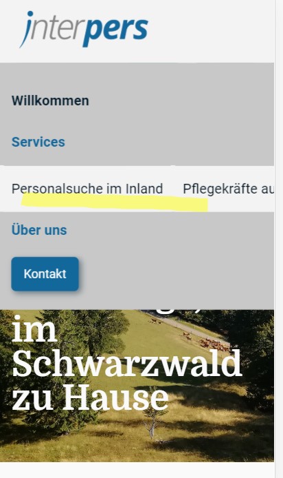
I first thought that the problem was the nav bar but the white space only appears on the following pages:
“Über uns”
“Personalsuche im Inland”
“Pflegekräfte aus dem Ausland”
When I navigate to one of these pages the drop-down in the nav bar also changes…
In general, the website is also quite slow on mobile even though it loads fast on desktop.
For the issues with speed, I’ve noticed that full background images are used for for all viewports.
When a background image is set, smaller version of this image are not made responsive by Webflow.
To fix the slow loading (of images specifically) I would advise resizing the images Desktop images for Tablet > Mobile. Example, you use a 2000px width image for Desktop, resize this down to 1000px for Tablet, 800px for landscape mobile, and 500px for mobile. Also, ensure that you run any images through TinyPNG to compress the size further.
You maybe could also use an image instead of a background image. And use it with the img-fit property to mimick bg-img “cover” or “contain” properties. This way Webflow will produce a responsive version of the image. Do you think this will work?
Ah that makes sense! Thank you so much, I actually didn’t know that I had to adjust the images separately. So background images need to be adjusted manually and images will be automatically resized?