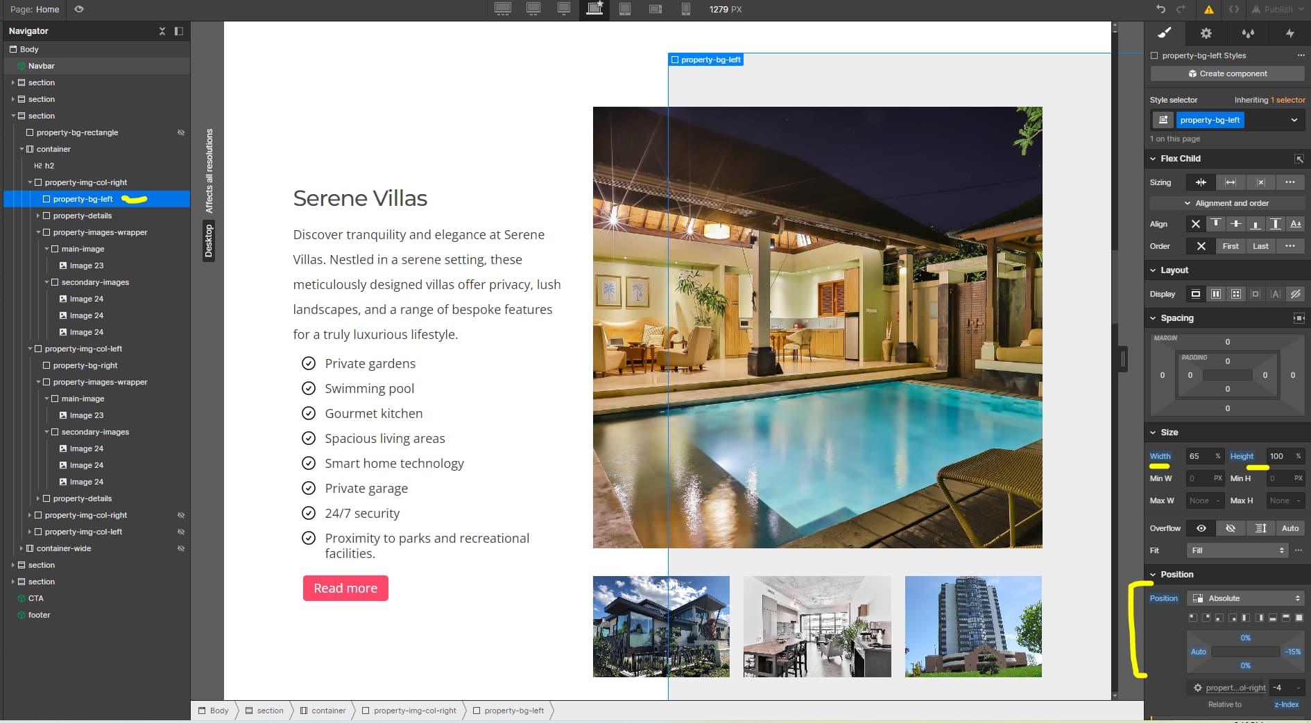
Hi Guys, I am trying to develop my second website with webflow. I have issues in my layout. The issue is in the featured section. I wanted to show a main image of a property and below that image I want put 3 or 4 images of the property depending on the size of the screen. Behind the main image, there is a grey background. This grey background is not aligned in the same line with the main image. I have done this purposely. The grey background is aligned about one inch right to the main image and both will stretch to the edge of the screen/website. Below the main image, when i display the three/four images, i want to align them horizontally with several pixels gap between the images and grey area is shown on top and bottom of the images. These images (3/4) should stretch when the screen size increases and wise versa. I have used absolute/relative positions to align these images close the main image.
The issue is that these images are not displayed on the same area in the website preview as the designer. The images are shown with several pixels distant to the location where i want them to be. I don’t know why this happens. So, what i did was to adjust the designer so that the images in the website preview are shown in the place where I want them to be. Please help me to find the reason. I donot know what mistake i have done. Please see the read only links below. Thanks in advance for your support. Regards, Chamika
Here is my site Read-Only: LINK
([how to share your site Read-Only link][2])
Let me know. There are issues with layout and div block placement.
You used div block to put images. this is not best way to do this.
You can take one div block and put all images into that.
See these layout changes
Thank you junglegymco for your reply. Yes, the layout you suggested also look good to me. Putting images in several div blocks was that the problem? I have put images as backgrounds in div blocks. Is putting image elements in one div block (and not as background) and positioning the parent div block flex the best practice, when there are three or more images? My layout has sever displacements in larger breakpoints (website preview is not in line with the designer for larger breakpoints and the displacement is more sever for larger breakpoints), if i make changes to my design as you mention, will that solve the larger breakpoint issue as well? Can you please see larger breakpoints too? Thank you so much for your support.
I am glad that your problem is solved.
I suggest you that always use vw, vh, % value not in px. this will help you in a responsive model.
it will change the value as per view port size not in pixel.
Also, you can use the display option as much as possible for all breakpoint.
All div block and image class name is same so you can apply changes for all in one setting.
Let me know if you need help.
If solve please mark as done.
The places where images are in the designer are not the same as site preview. So, I change the position of the images in the designer so that the site preview is in line with my design. The site preview is the right one. But what i am saying is that the images in the designer should also have displayed in the same position, isn’t it. I hope i explained my issue here correctly. Can you check the images i uploaded.