Hello,
I was just wondering if its possible to achieve this sub slider with the mac screen in webflow?
How would I go about doing something like this? any help would be appreciated!
Thanks in advance,
Matt
Hello,
I was just wondering if its possible to achieve this sub slider with the mac screen in webflow?
How would I go about doing something like this? any help would be appreciated!
Thanks in advance,
Matt
Hi @Matty,
It is absolutely possible  just add image of device on slider background (instead of color) and make slider mask positioned and sized just right like screen size.
Play around and try 
Cheers,
Anna
I’ve had an attempt let me know what you think or any changes you would make, is there way to change it so when the slide of image changes it doesn’t slide over the monitor?
https://preview.webflow.com/preview/dlux?preview=61794315af9c601c95a7be039ef9b75b
Hello @sabanna
Thanks I’ve applied the changes which you recomended, but when I view the slide it deosnt seem to fit inside the monitor, some white spacing as well as some overlaping on left side.
Would I need to change the width of the image? or is there something else which would make everything flush.
Thanks for your help.
Matt
Hi @Matty, can you please update your post with some images of what you are currently seeing and what your desired result should be? This will help us hep you faster.
Thanks in advance 
Thanks for the reply, I’ve attached an image which you can see the website doesn’t fit inside the screen properly and has white spacing. Is it the mask causing this issue or the slide itself? as it happens on both my slides.
.
Cheers
Matt
Hi Matt,
The easiest thing would be to make the white screen of the Mac background image black instead of white. This will be more forgiving and give you more room for error.
Otherwise, it looks like you need to oversize the width of your slider a little bit to make sure it covers the area you want properly and then reduce your mask to fir the Mac display area.
Cool site BTW…
JFly
Attaching a Mac Display with Black BG

Hello,
Thanks I’ve made those changes which you recommended but some reason the top right part of the screen doesn’t fit as well as it should. I’m sure I must be doing doing something wrong which is so simple!
Thanks for kinds words, its taken alot of time to get my head around Webflow but its coming along slowly.

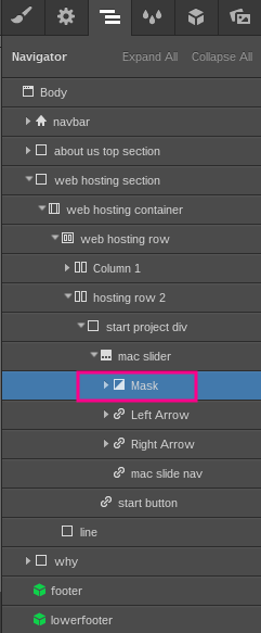
Hey Matt,
That looks better to me and less noticeable. Honestly, I don’t think it will be as noticeable by most site visitors as it is to you or I now that you’ve pointed it out. I know, I know, to the one designing it, it seems to stand out like a blinking neon sign!
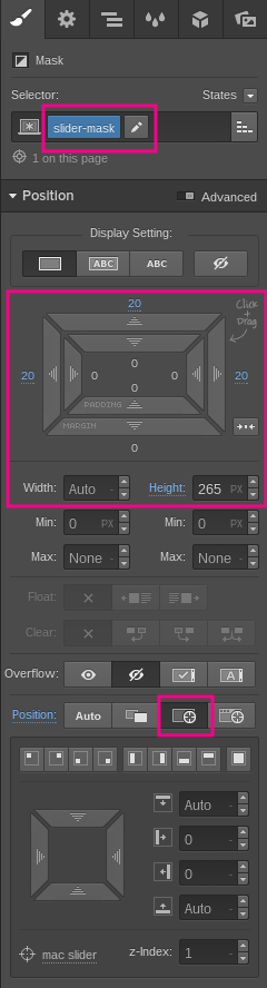
Have you tried adjusting the right margin on the slider mask element? I noticed that the padding is 20 on the left and 21px on the right (see attached). You might try reducing the right margin to 20px and possibly increasing the width go the slider mask a bit. It’s currently set to “Auto”.
image
Looks like you fixed it @Matty
I seem to now be having issues with making the slider responsive to other devices, how would I go about achieving this? as parts of the screen/slide is cut off.