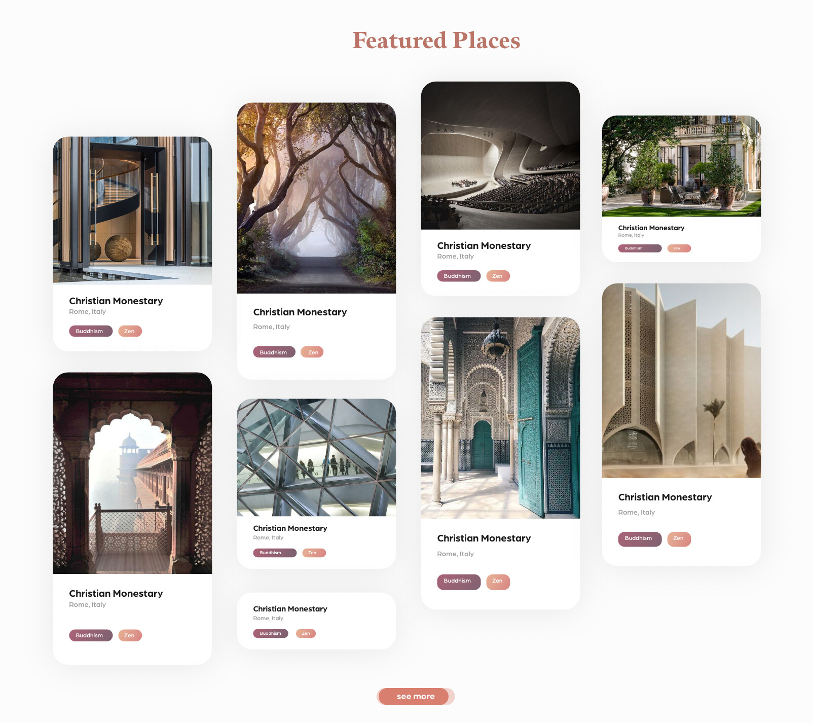
I’ve created a CMS collection list and turned it into a masonry grid by using text columns. Now I’m wondering how I can stagger the upper row of CMS items like in the prototype above?
I’m really interested in this, because I’ve tried all sorts with grids and columns to get a set of good masonry layouts and they just seem too unreliable for a client site unfortunately.
You may just get away with columns on this layout, but for the beauty of this layout you probably need to know the parameters of the images and texts so you can adjust margins on selected (probably calculated) elements. Of course this is possible if you can reliably know/calculate the dimensions of the inputs. But as with everything in this space, garbage in = garbage out.
I have a whole project file for masonry where I keep trying to adjust things to make a set of perfect layouts I could use in our work projects but there are always problems - and in most cases, the problems are with the Safari browser.
Could you share the link where you found this please? Also, your share link doesn’t seem to work…
@Fonsume thank you so much for your help!!
How exactly do I have to connect the script with the specific collection items? So where in the CSS do I have to put the class of the collection items?
Thanks, but actually this is just getting started.
In my workings so far I’ve been able to address a number of issues (such as where the element breaks, to keep items whole and not spilling over to the next column) but the one thing that I’ve never managed to solve is keeping the alignment perfect across the top on all the main browsers, again - Safari being the main issue. I guarantee you’ll have issues with just using columns on its own when you’ve got more to the card than an image - you just may not spot them.
Something to consider when explicitly stating margins in JS is that you need to break these down to fit breakpoints appropriately otherwise it’ll look very strange on other devices. This is why I mentioned calculations initially and why this is a lot more complex if it’s to be done well and account for dynamic items.
@iratefox could you send me a read-only link? then I could check it out.
It is important that you set the collection list and the collection list wrapper to the display setting “block”. The Collection item has to be set on “Inline-Block” in order not to break.
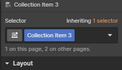
Your collection items currently has the class name “Collection Item 3”. You can change it to whatever you’d like.
Just click it and change the name.
You have inserted the code in the correct place. You need to swap the “COLLECTION ITEM CLASS” bit in it to the same name you choose above. Modify the pixel counts in the code as needed too.
Hi @Fonsume
thank you for your detailed answer.
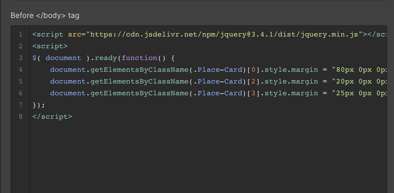
I’ve renamed the class and replaced the “COLLECTION ITEM CLASS” bit with it. But unfortunately it sill is not working.
Here is a screenshot of the script. What have I done wrong?
Yeah your right my bad that should be working, if its still not working you could try changing it to ‘querySelectorAll(“.place-card”)’ or ‘querySelector(“.place-card”)’
Wow this topic is right on-point with what I’m trying to achieve! I’m building a CMS-populated masonry grid, in three columns. However, instead of just having images in the grid, each element is composed of a Div block with multiple text blocks and a button. The problem I encounter is that when I set my Div block to “Inline-Block”, the top Div Block of the 2nd and 3rd columns stacks over the second Div Block, as if the columns don’t account for the space occupied by that top Div Block.
If you look closely, you will also see that the Box Shadow effect of these Top Div Block are cropped at the top.
What am I missing? Hopefully there’s a simple no-code solution for this?
EDIT: Safari has a weird behavior. It separates my Div Blocks on multiple columns! (Although the top blocks don’t stack on top of the 2nd block)